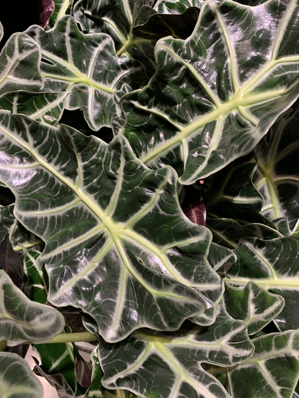
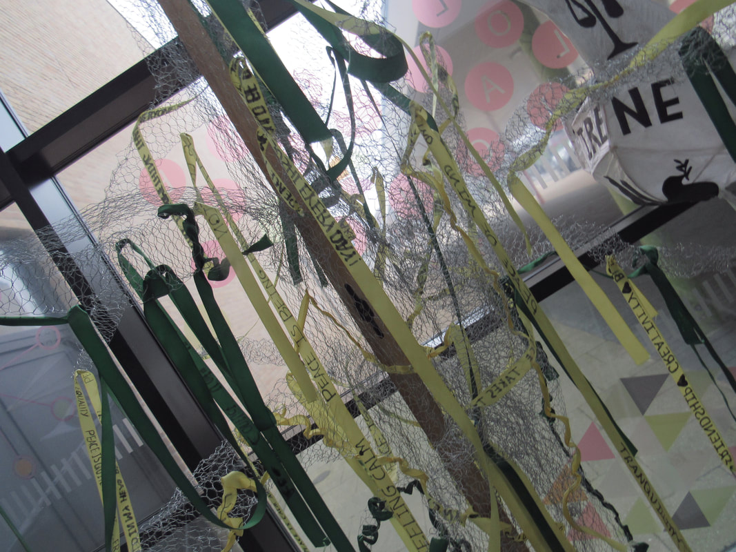
Welcome to my edges page here you will see all my hard work focusing on edges with many different materials. On this page you get to see many different varieties !
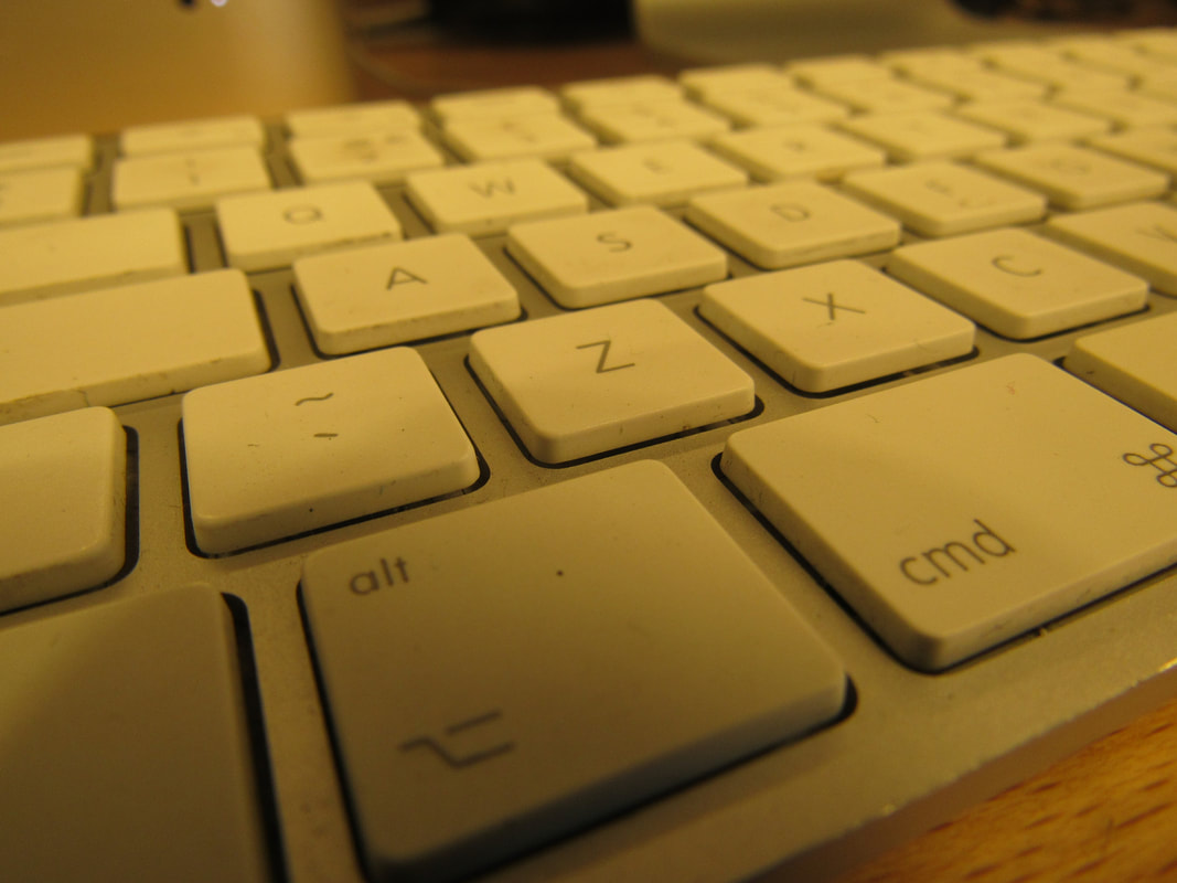
Edges in Thomas Tallis school.
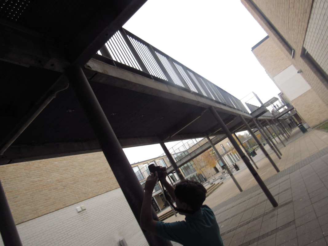
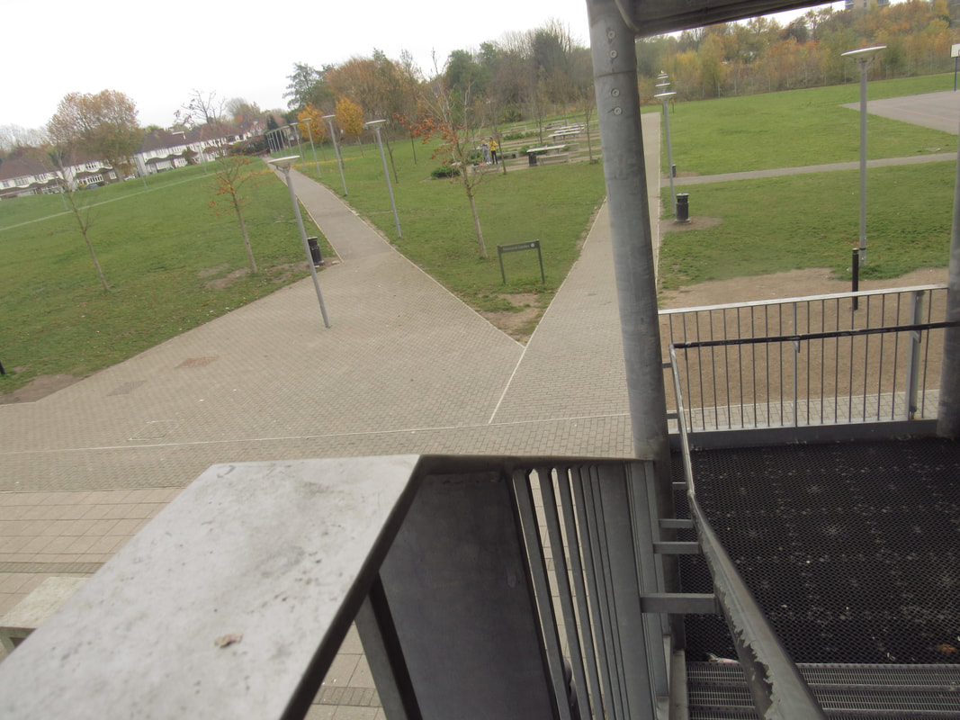
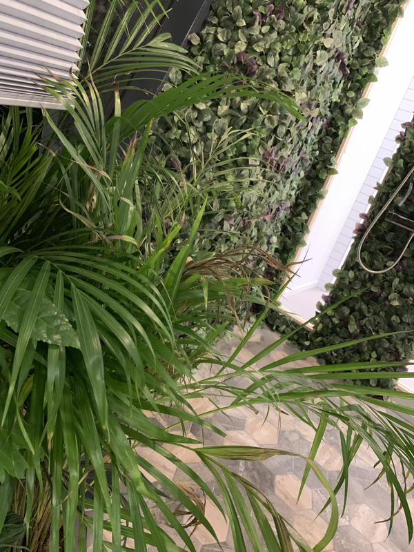
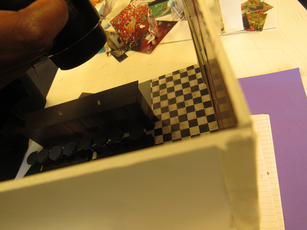
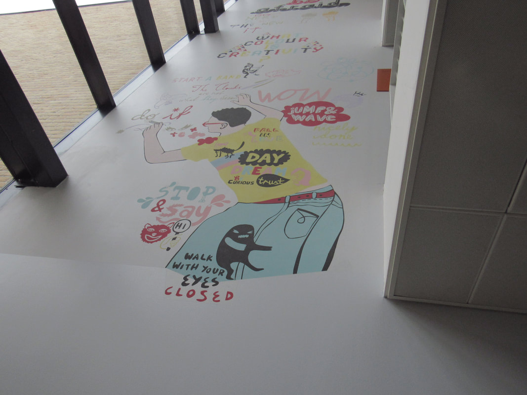
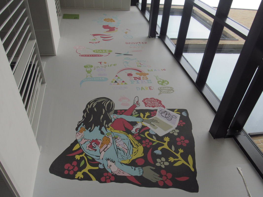
In class we was given a task to take pictures around school. I found this task because it lets me be creative and to go explore objects in school that we go past everyday.
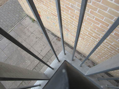
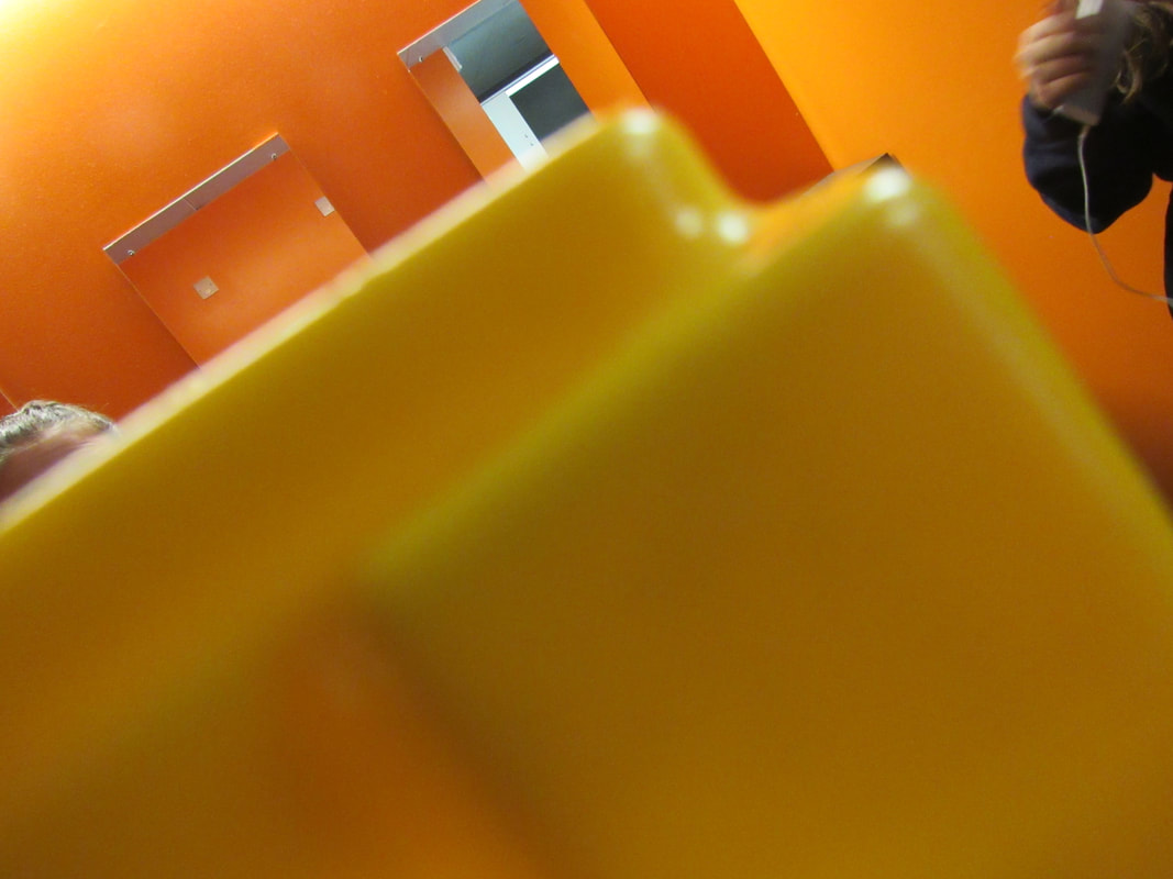
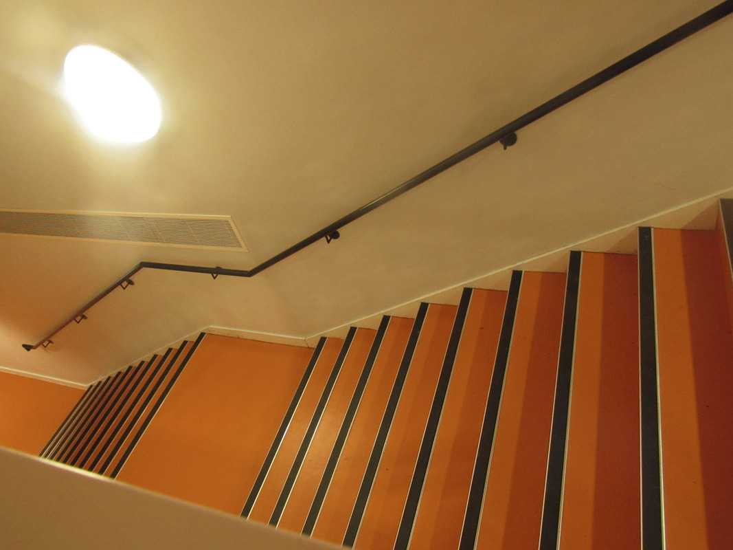
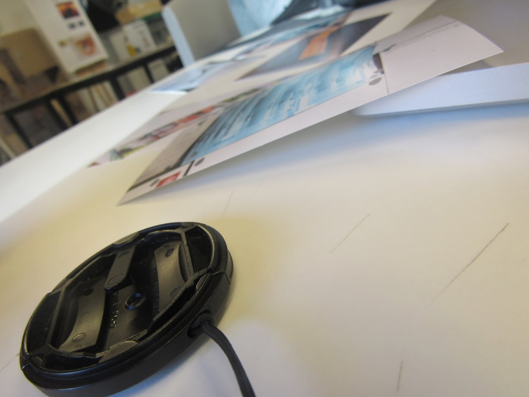
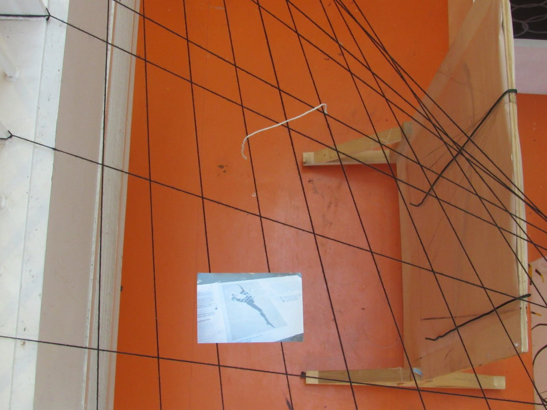
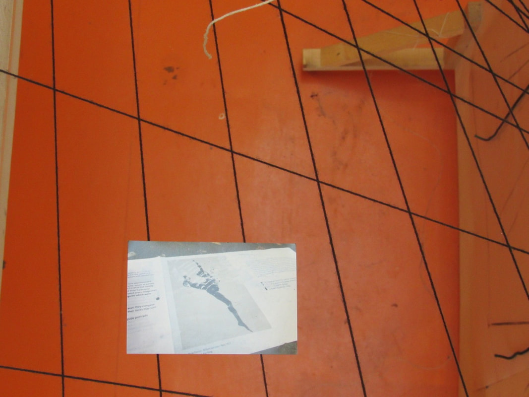
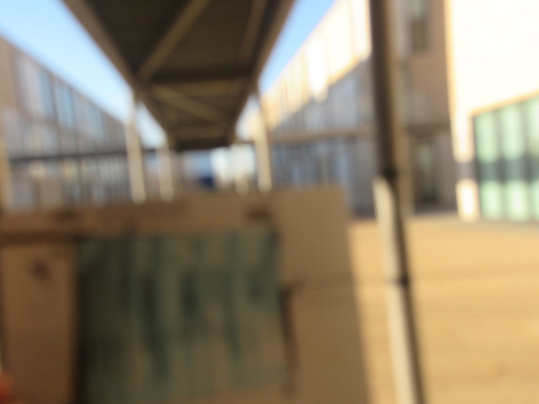
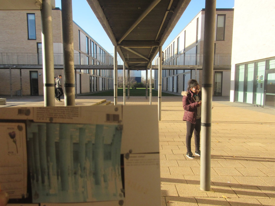
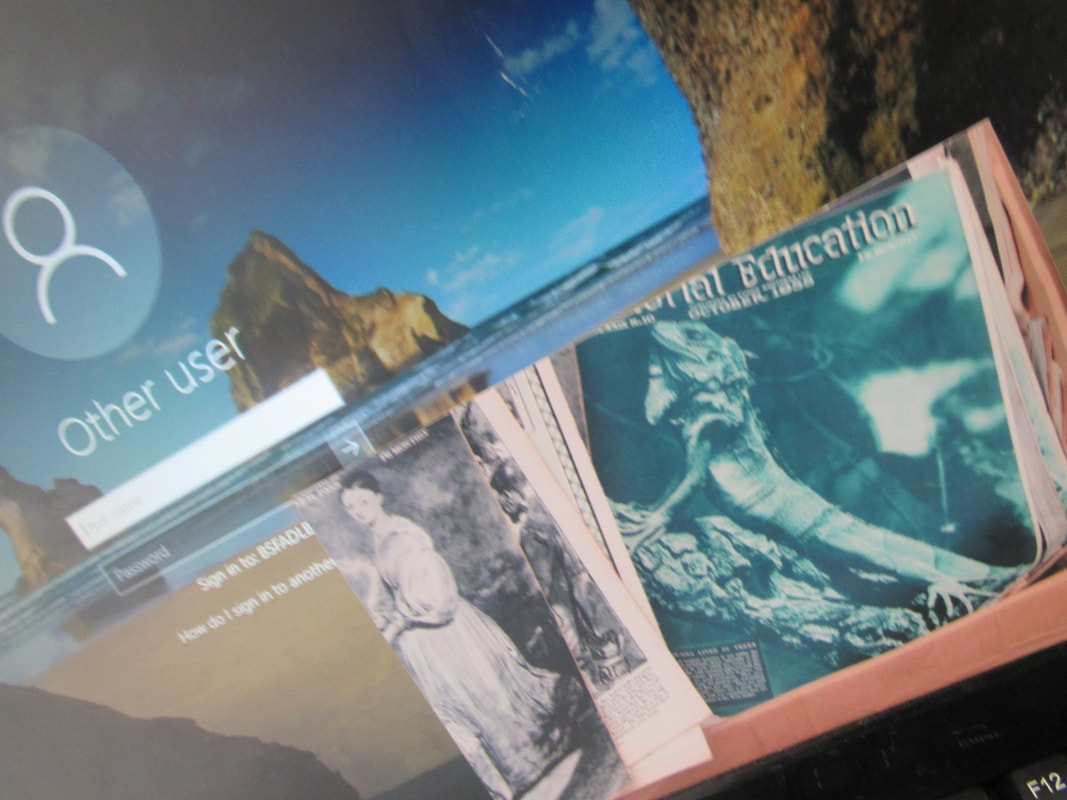
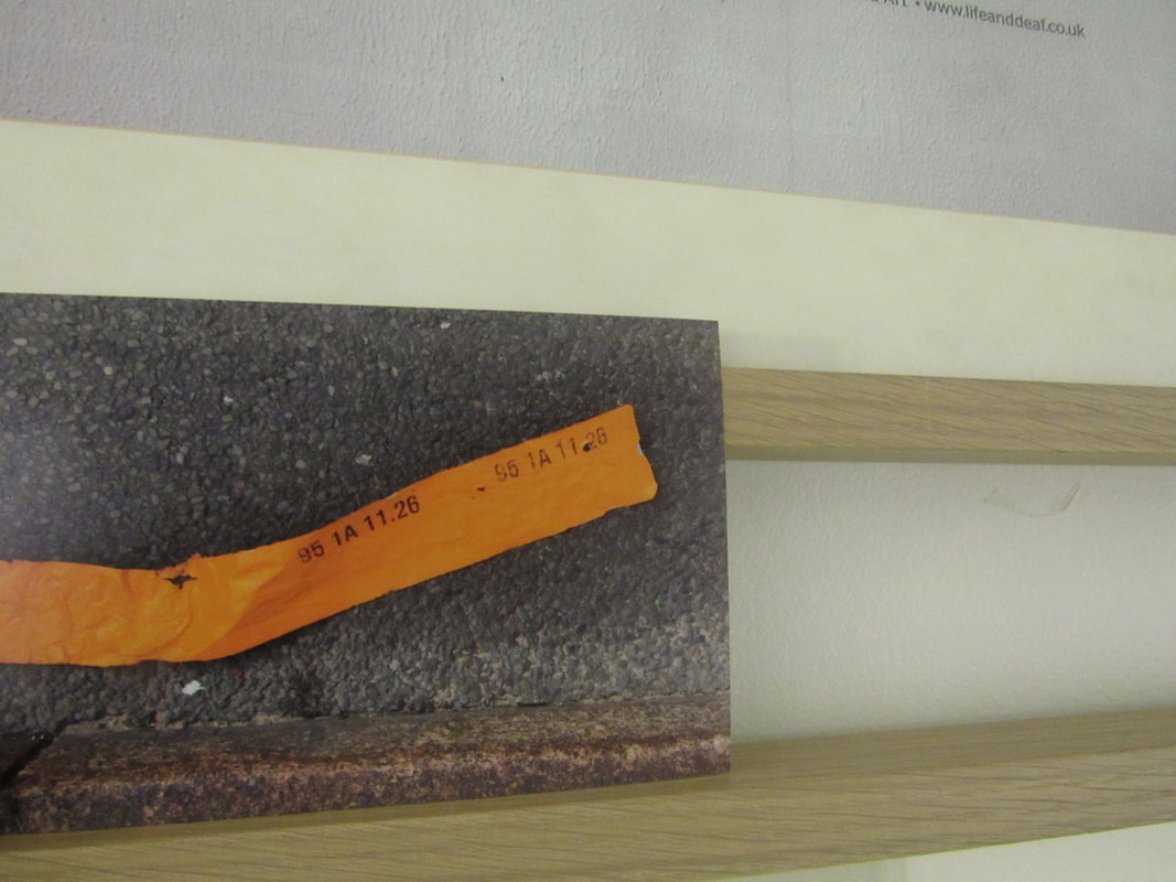
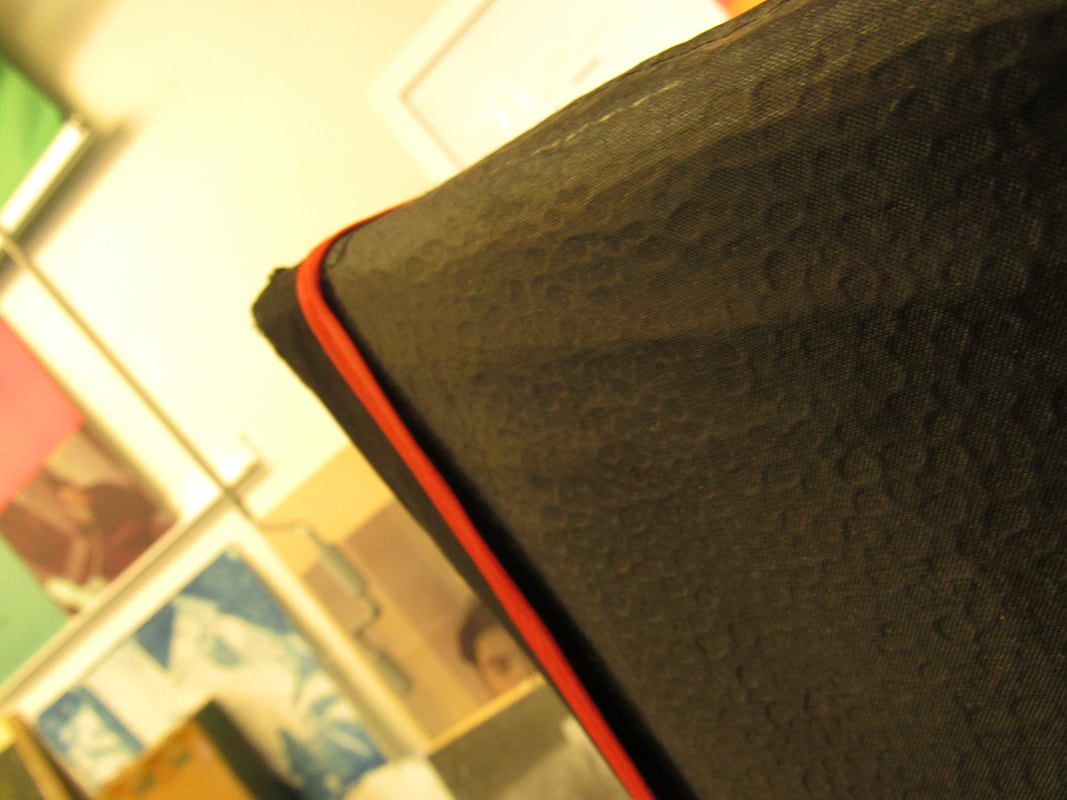
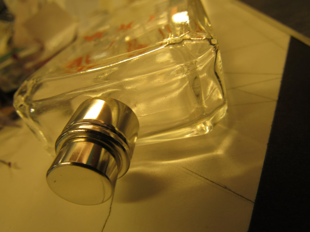
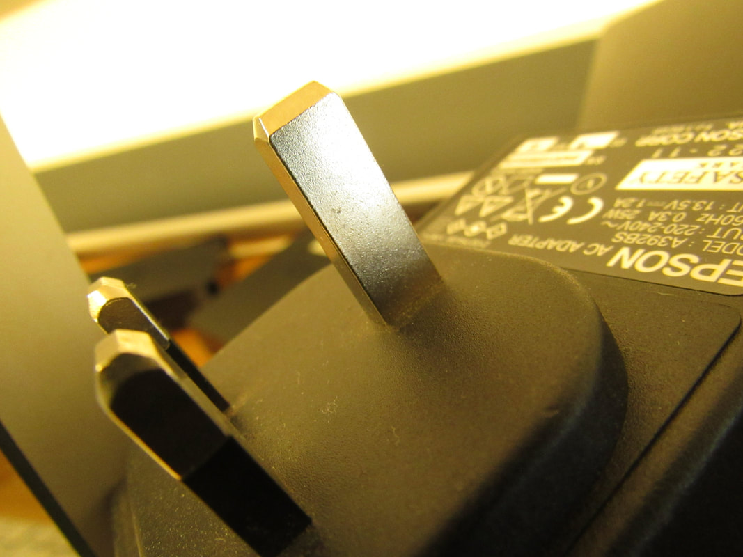
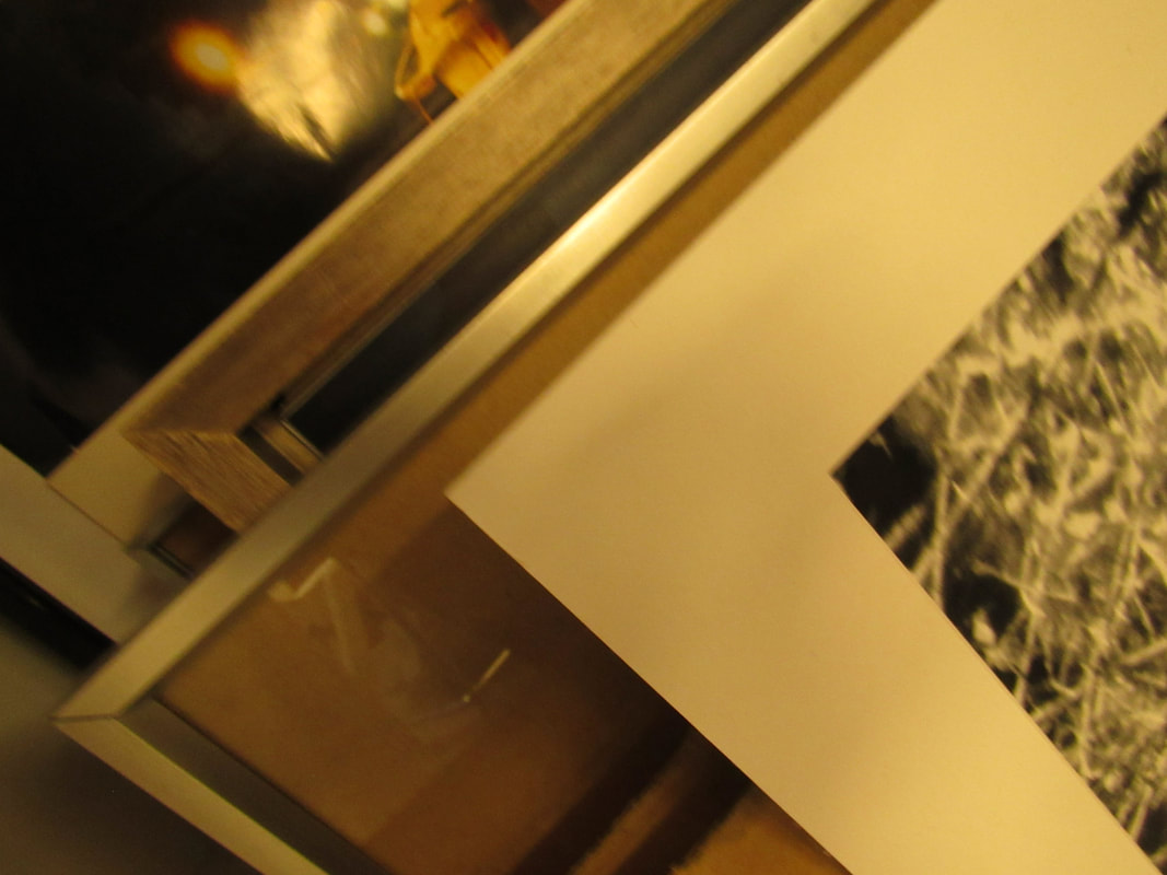
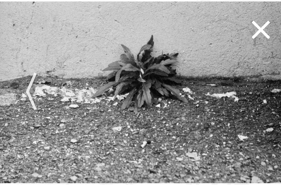
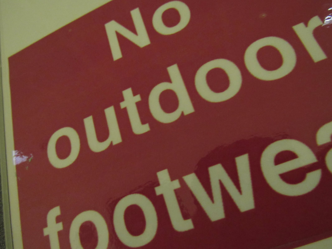
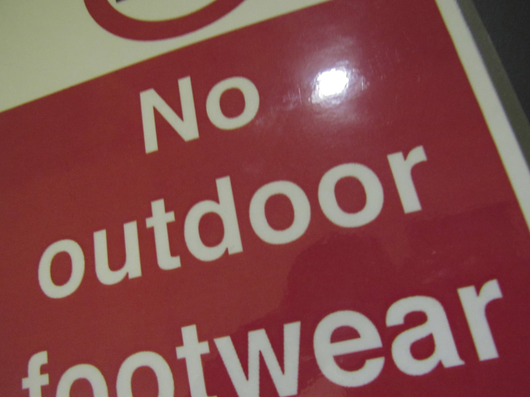
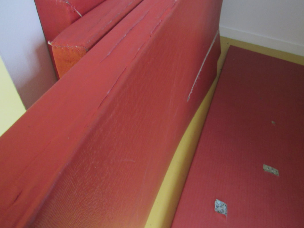
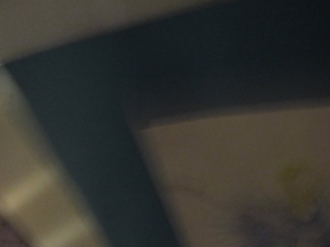
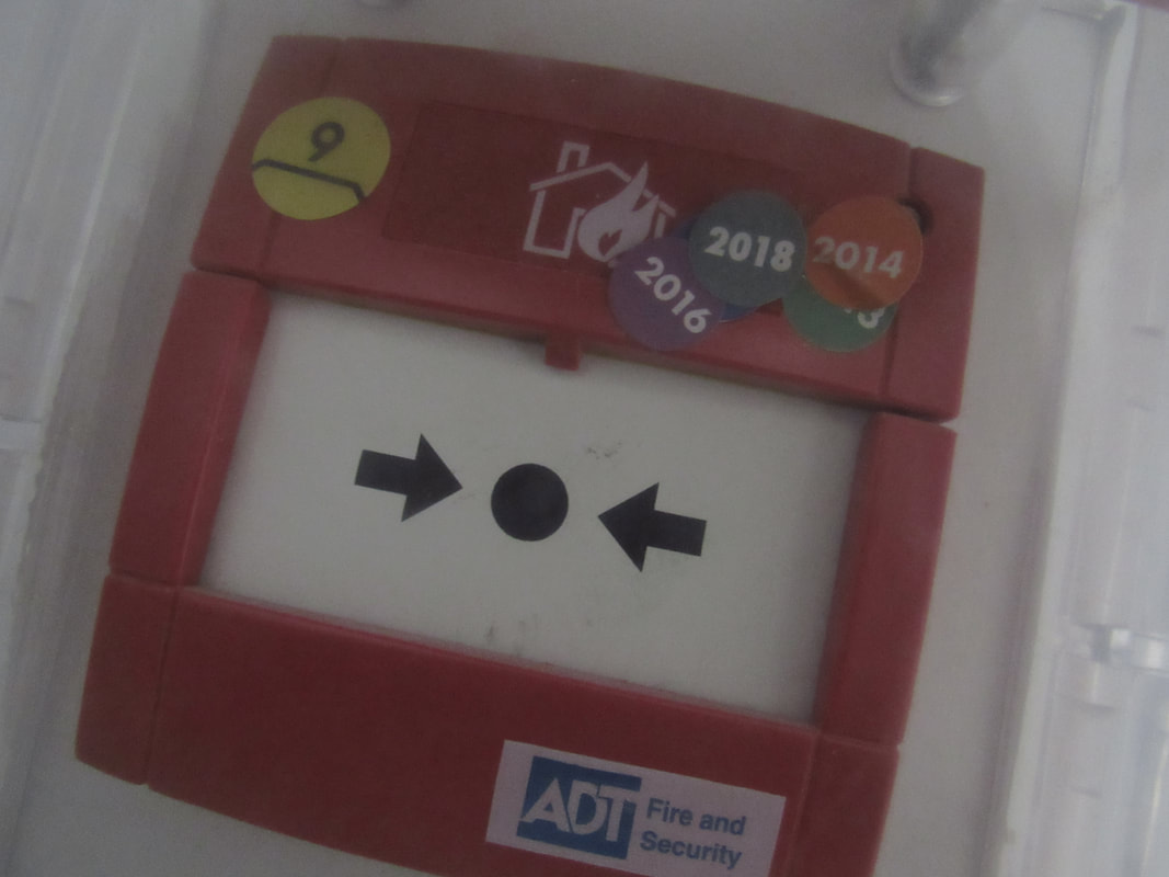
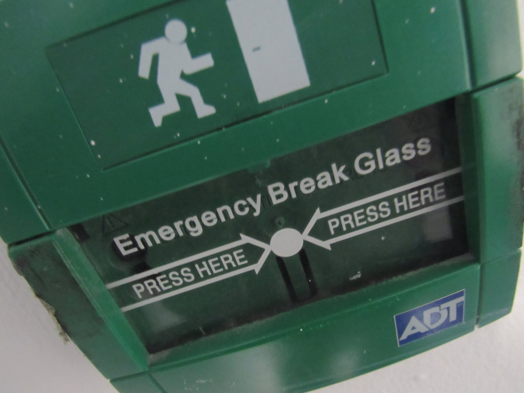
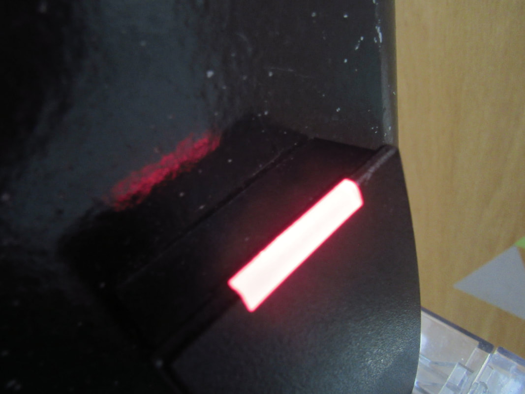
WWW: I focused on the edges the composition and spacing of this photo . As you can see there are multiple edges in one photo this is where I think I succeeded in taking this photo. I like this photo because It makes you think about what is going on in the photo instead of it being one simple edge .
|
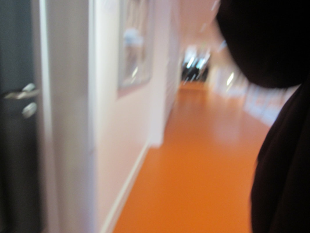
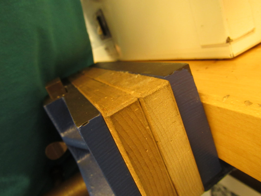
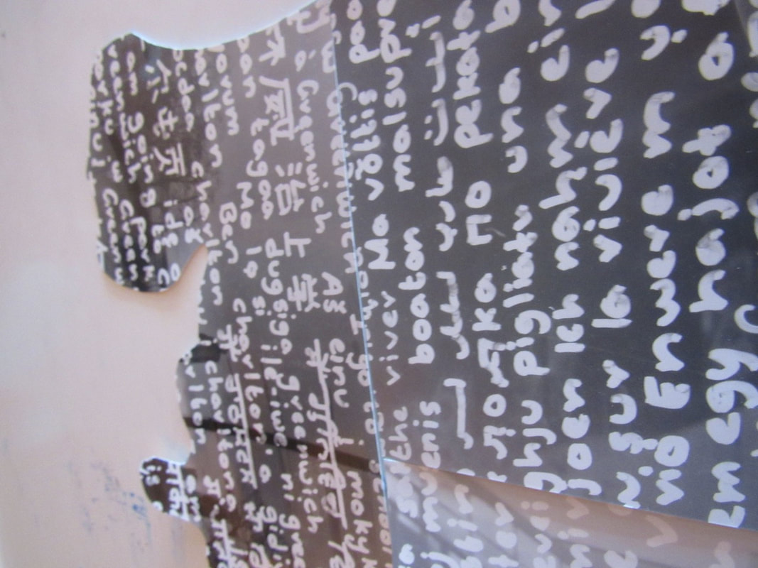
EBI: In this photo I think I did not do as well because you can not see the edges. The reflection from the mirror distracts you from the edge. I could make this image better by moving the camera forward so you can see the edge . In addition could maybe check my composition .
|
|

|
|
|
|
|
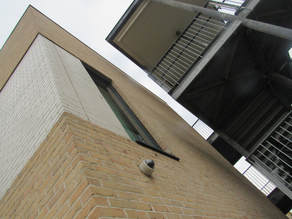
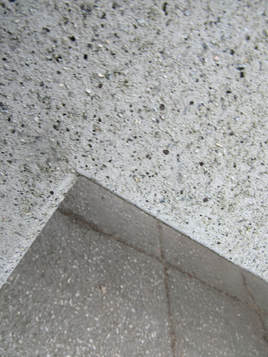
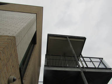
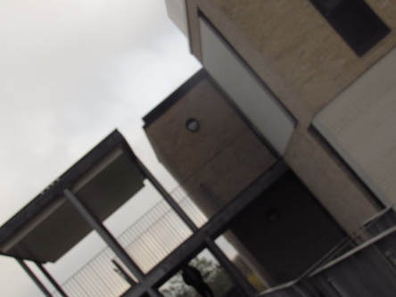
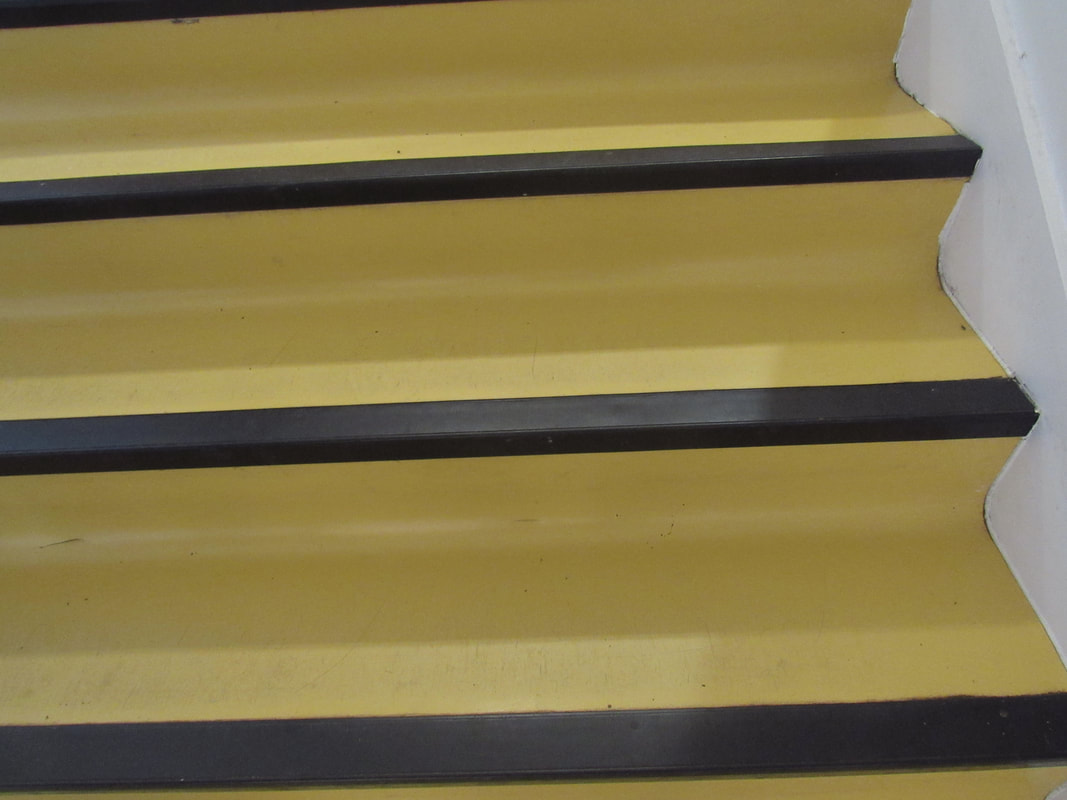
LookUp & Down Edges...
|
|
|
Homelearning
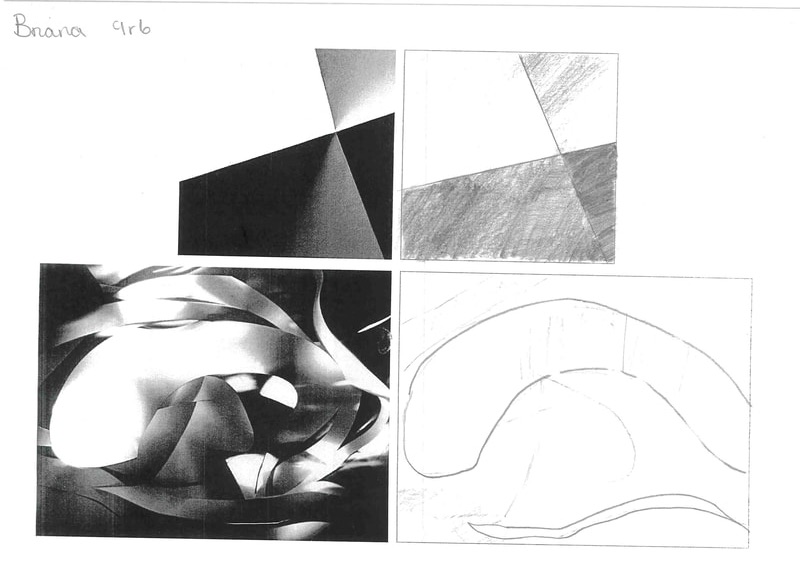
Edges with paper
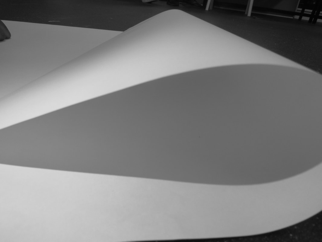
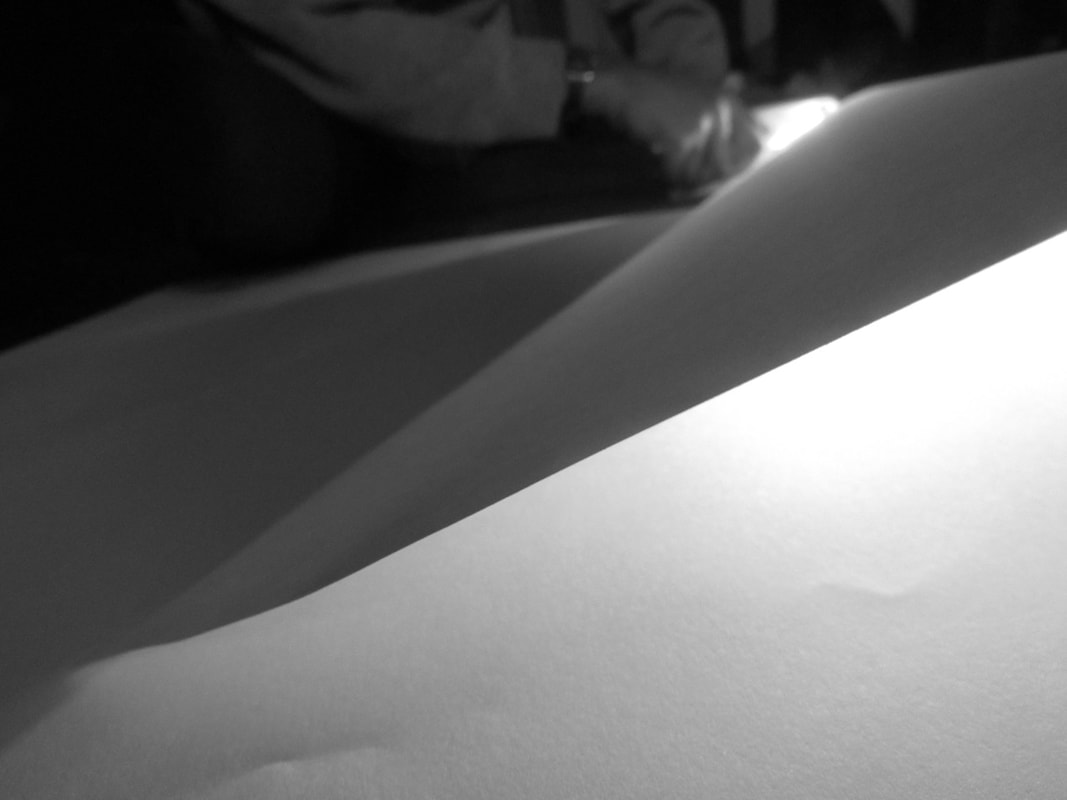
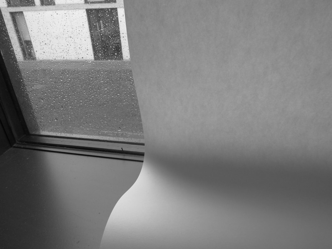
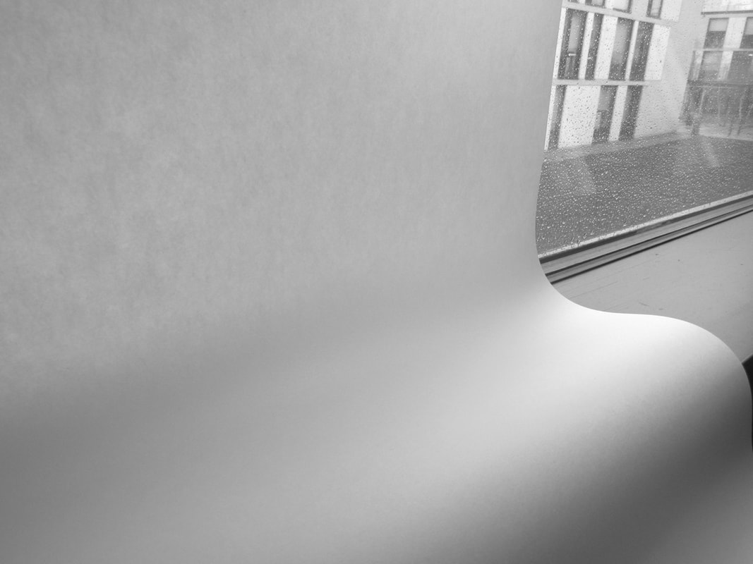
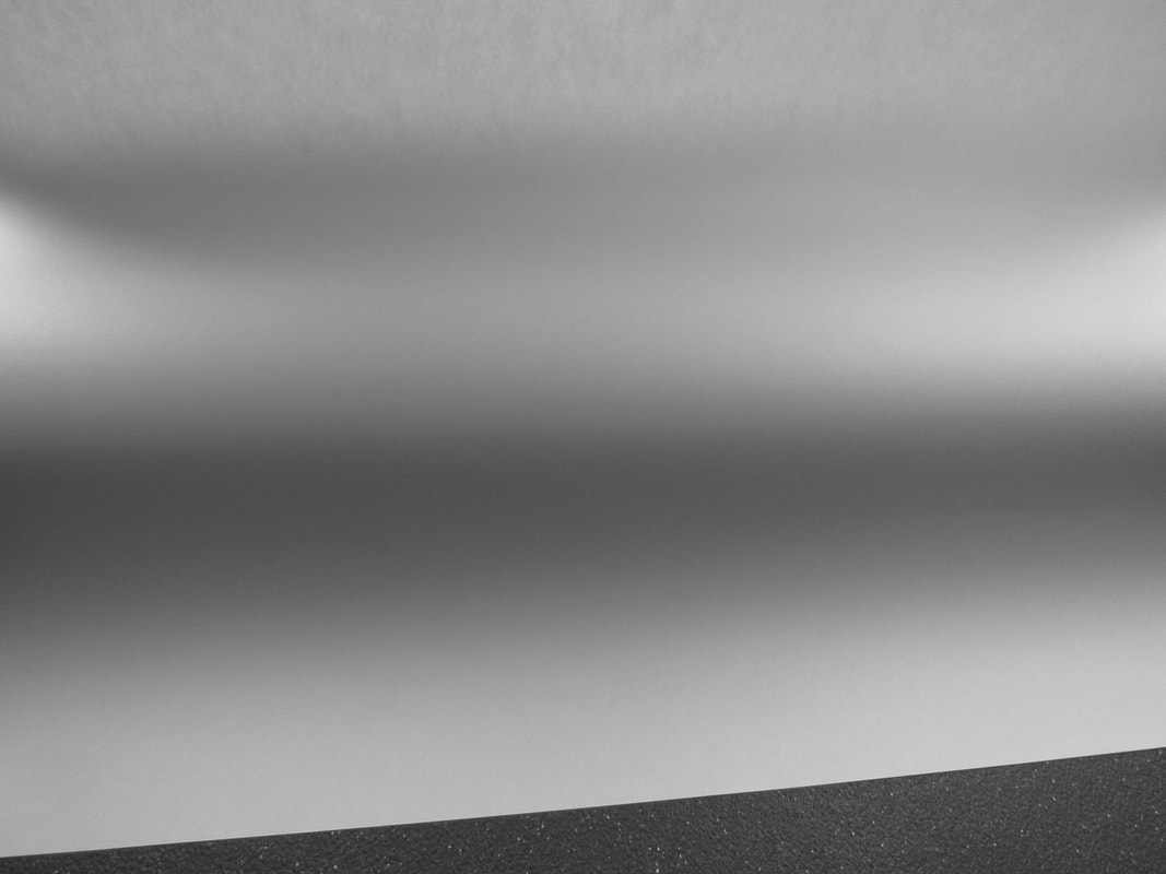
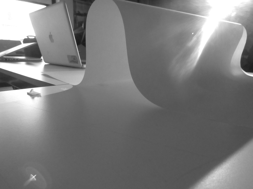
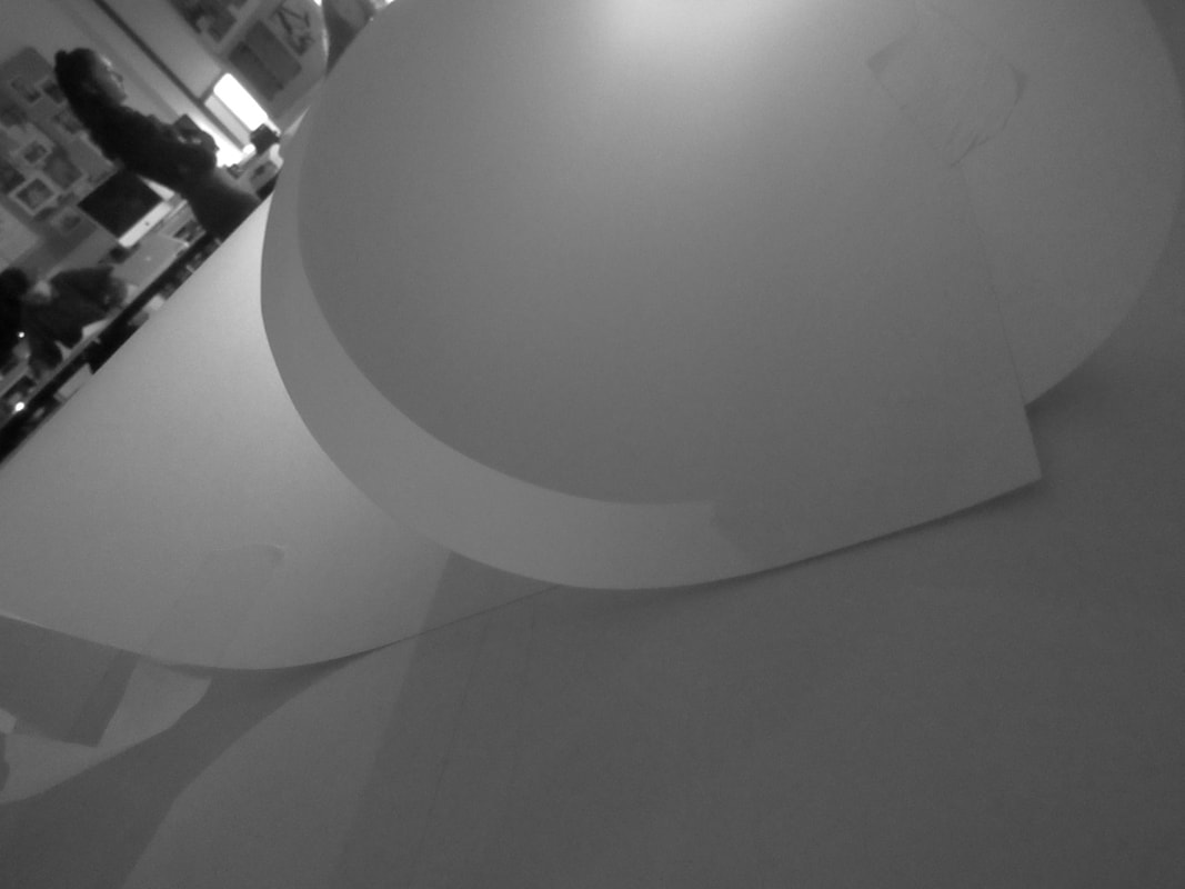
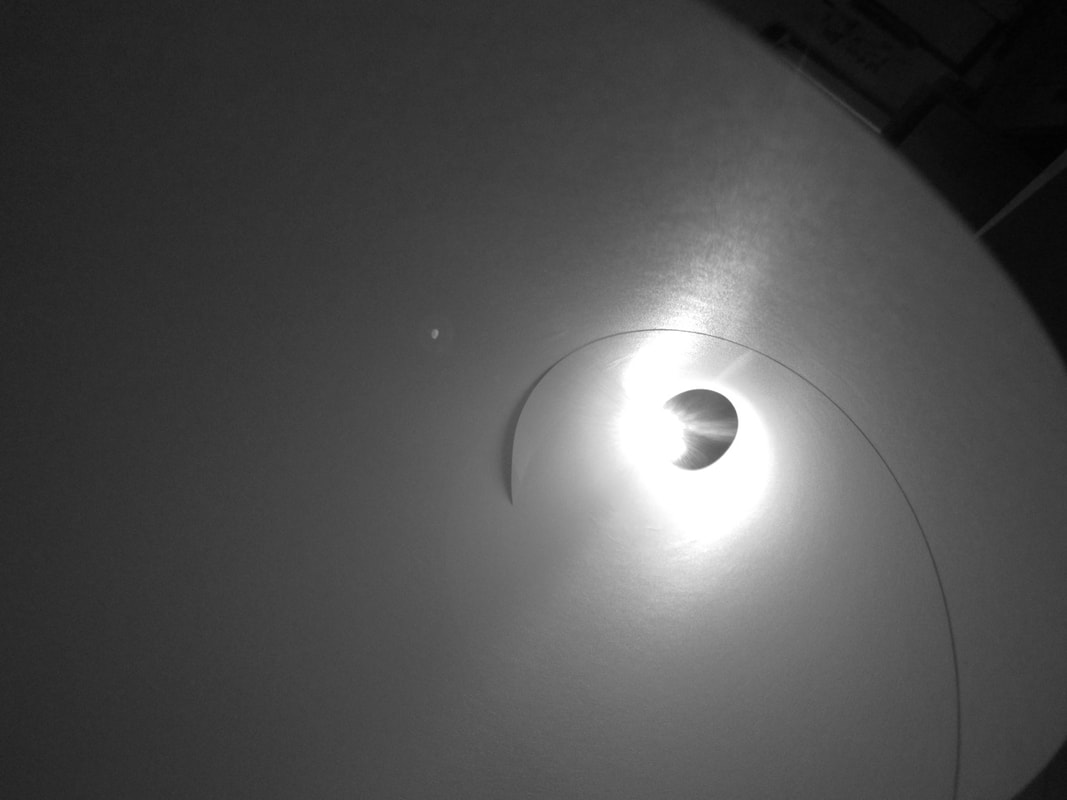
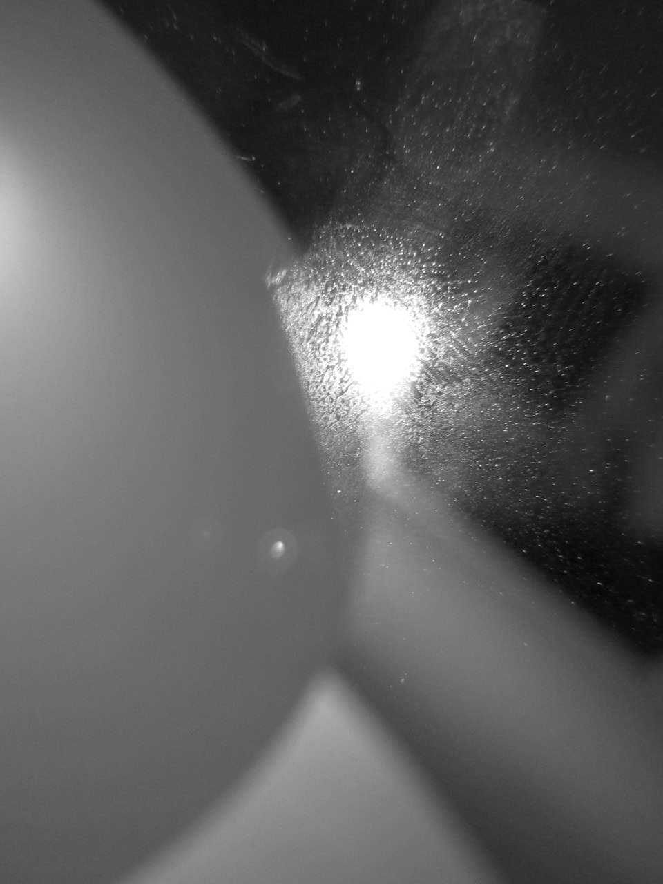
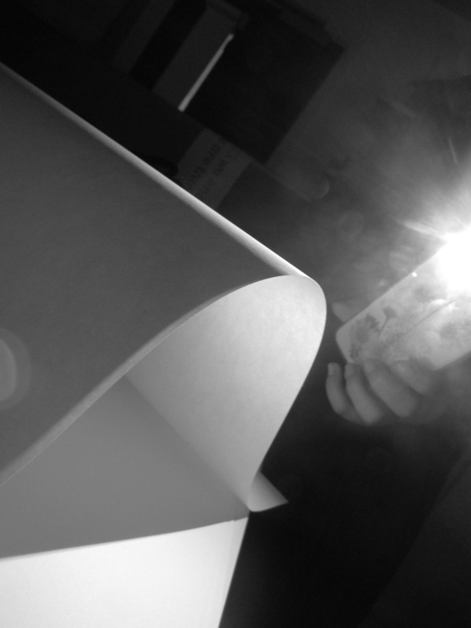
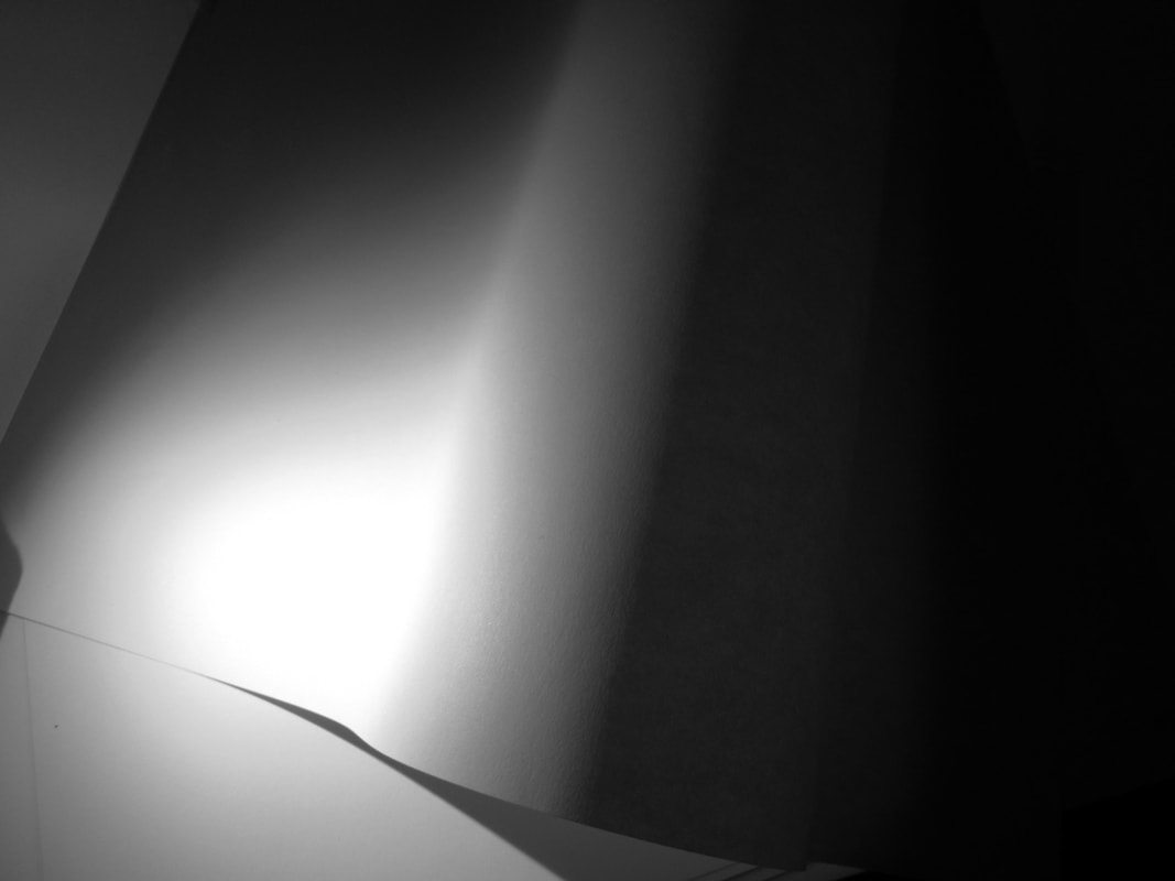

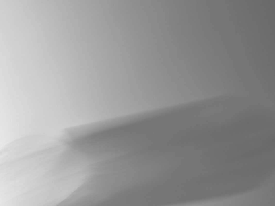
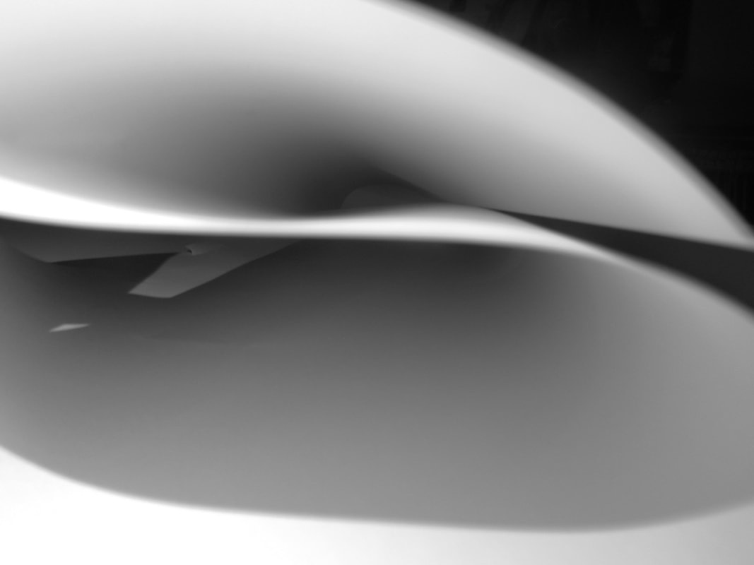
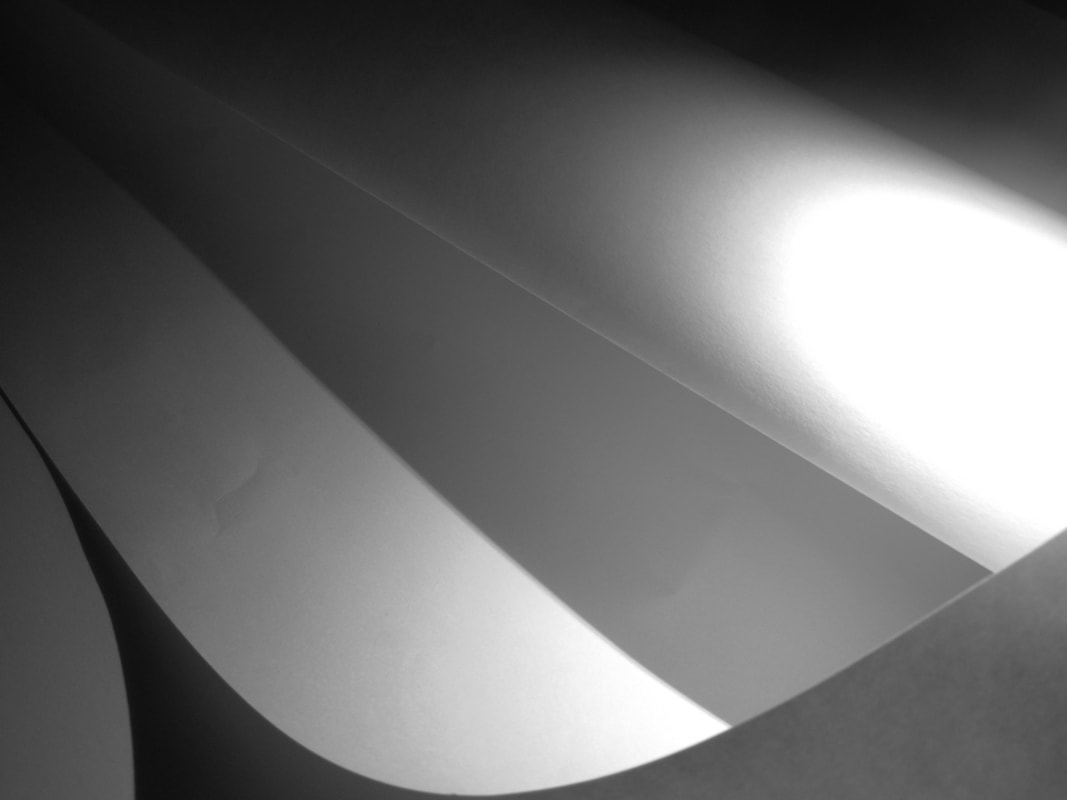
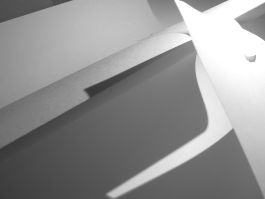
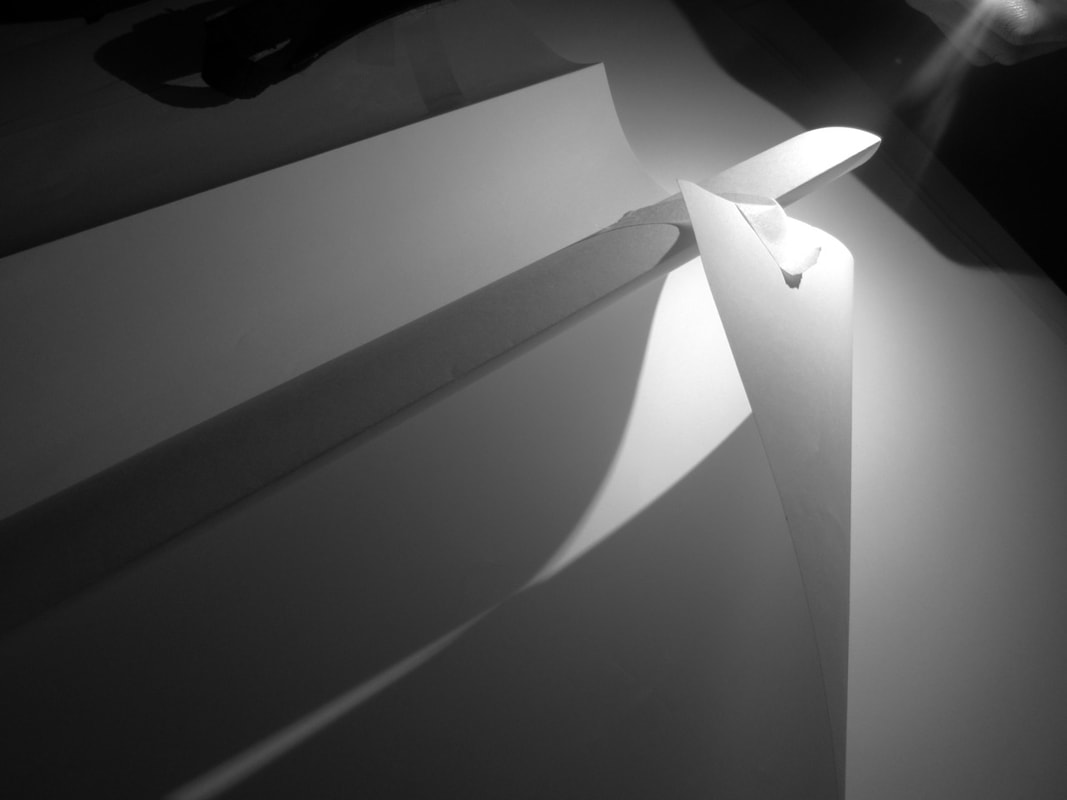
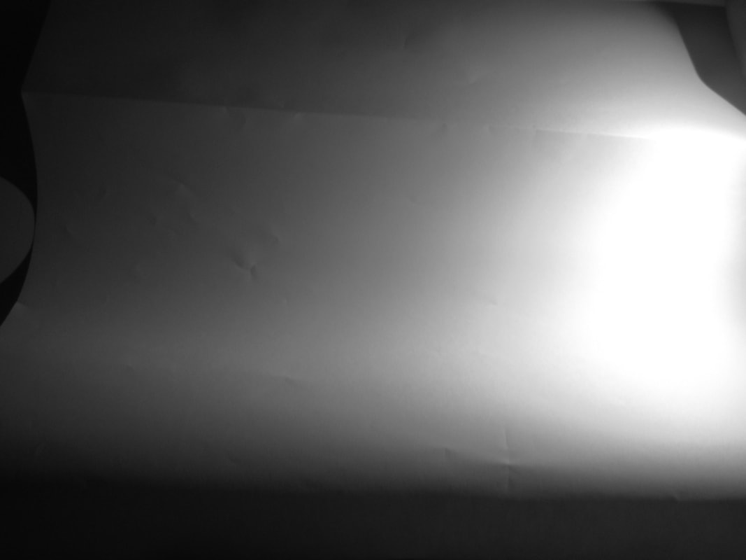
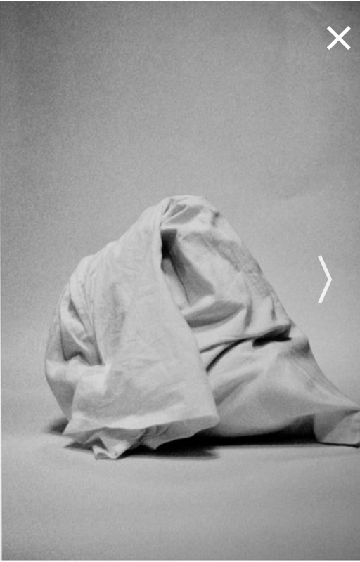
Today in lesson we were in the dark with a flash light ,camera and plain white paper our task was to take photos which include edges. In addition we could fold the paper in certain ways to create different shadows , lighting , effects , tones and exposure. My partner and I worked well as a team creating edges with paper. To add to this , I really like the effects the photos have on the viewer because it draws you into looking at the photo .
Alexander Rodchenko
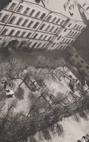
Rodchenko was one of the most versatile Constructivist and productivisit .artists to emerge after the Russian revolution . He worked as a painter and graphic designer before turning to photomontage and photography. His photography was socially engaged, formally innovative, and opposed to a painterly aesthetic. Concerned with the need for analytical-documentary photo series, he often shot his subjects from odd angles—usually high above or down below—to shock the viewer and to postpone recognition. He wrote: "One has to take several different shots of a subject, from different points of view and in different situations, as if one examined it in the round rather than looked through the same key-hole again and again.
In Alexander Rodchenko's work the most used elements that he uses are him taking photos looking up at people or metal structures. Rodchenko's viewpoint is unusual to the viewer because he uses the lines and structure of the photos to direct you looking up or down. I think Rochenkos favourite position is to look up. I think this because most of his photos contain people standing in structure looking up which automatically draws your attention to look up.
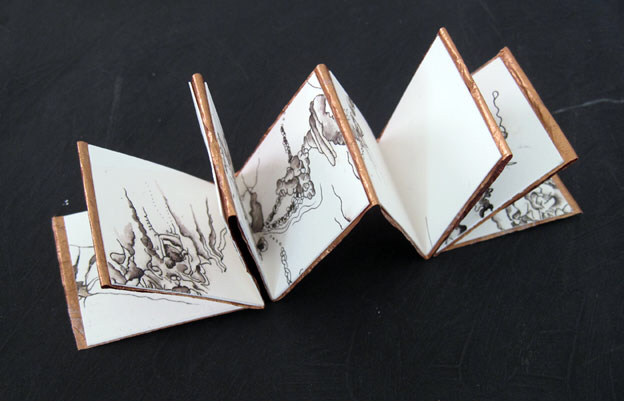
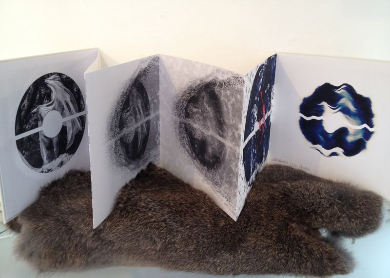
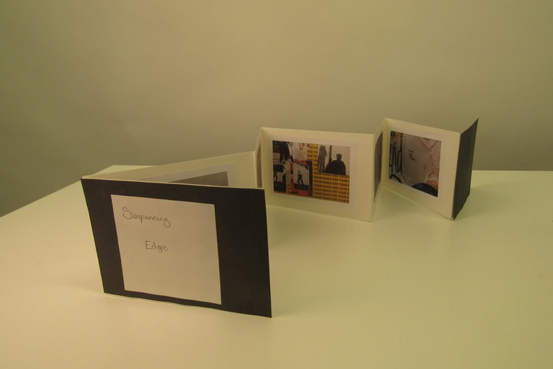
How to make a conertina book
|
This is how I made my concertina book. Firstly I had four pages of different coloured parer and I folded each edges to connect them to each other
|
|
Assessment
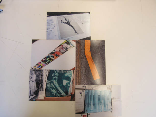
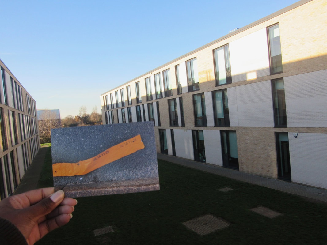
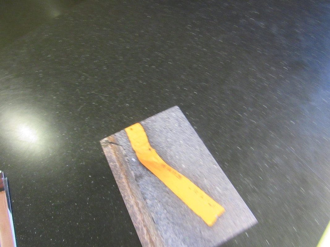
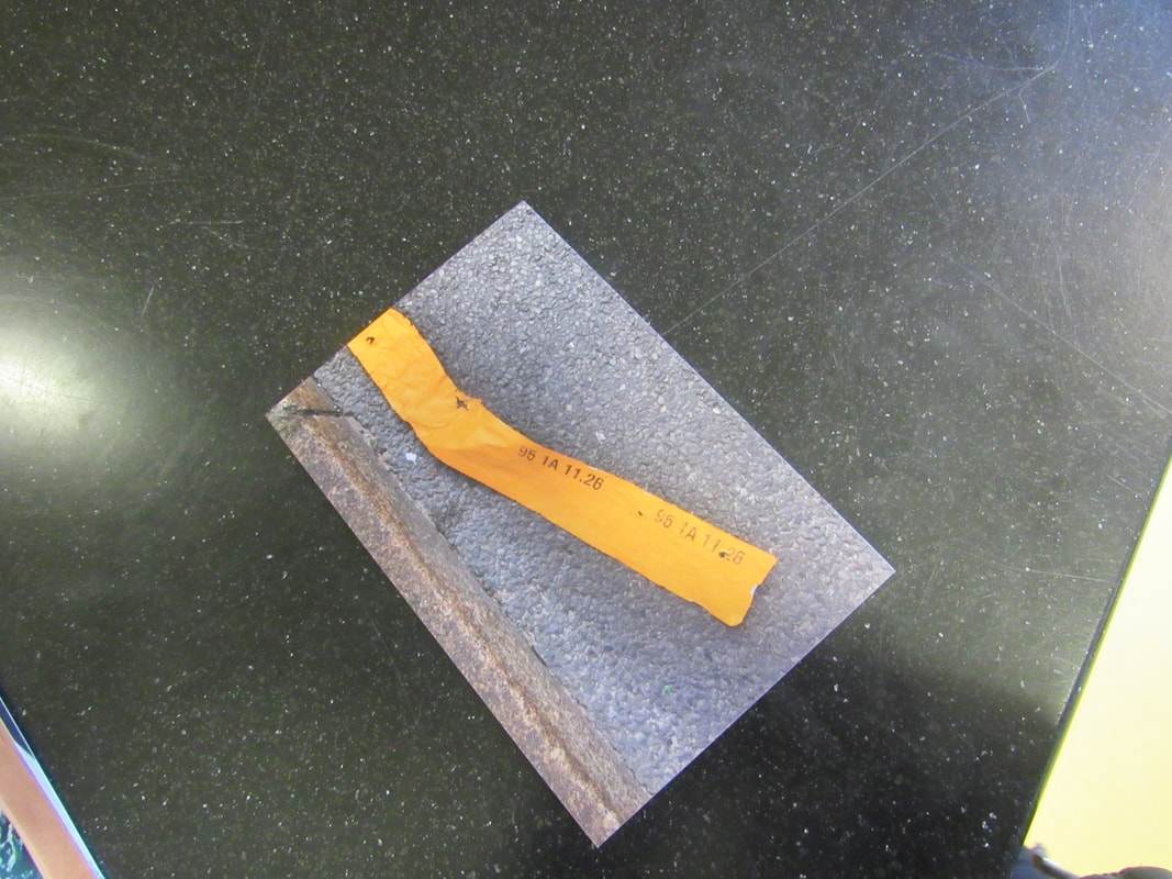
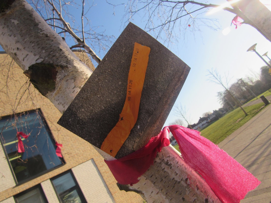
In lesson we was given 20 seconds to choose 5 pictures which we liked the most. I chose the top photo because its out of the ordinary which I also believe is abstract. The second photo I like because the orange stands out from the dull concrete . In addition , the third picture stood out to me because its a line of colour which can fit in with the others. In the forth photo I like it because it fits in with the first photo because its very abstract. Finally I chose the last photo because the photo uses cool colours with gives a chilled effect .
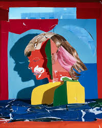
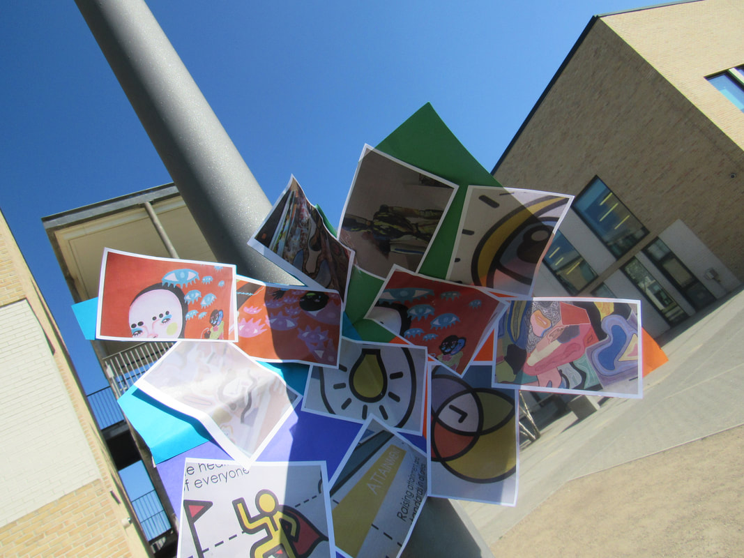
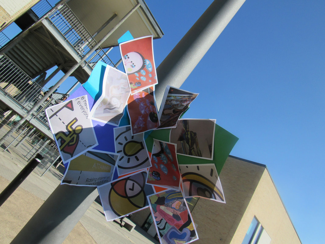
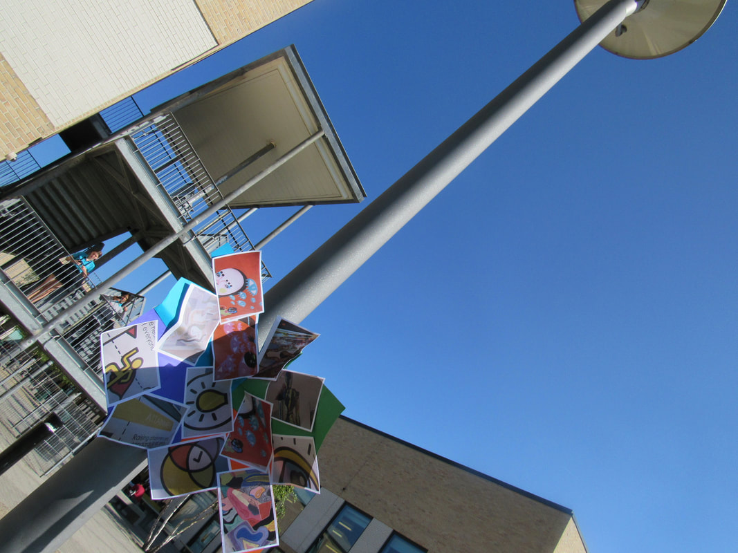
Sculptures
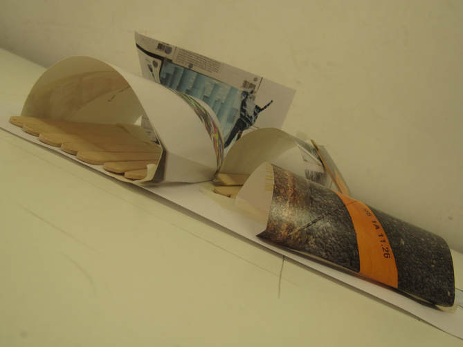
In todays lesson we was given a task to make a sculpture with the photo's we previously used last lesson. We was given, coloured card , glue gun , wire ,wooden sticks and much more. This challenged my creative skills as I had to think really hard to how fold and shape the photos to give a unique style. In addition it also challenged my persistence skills as I could not give up if my sculpture did not go correctly.
Landscape + Photoshop image.
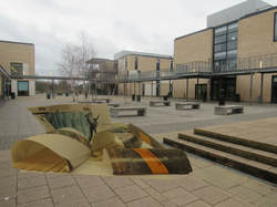
WWW: I worked really hard on photoshopping my sculpture onto my landscape.In addition I really like how it catches your attention because you can see the school and then my sculpture stands out to you and makes you wonder what its doing there.
EBI: I believe I could maybe blend my sculpture into the background a bit better so it looks more realistic. To add to this I could also make my sculpture bigger to make it looks like the image belongs there.
EBI: I believe I could maybe blend my sculpture into the background a bit better so it looks more realistic. To add to this I could also make my sculpture bigger to make it looks like the image belongs there.
|
|
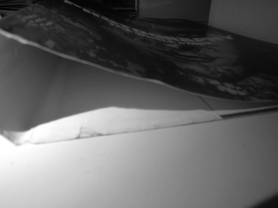
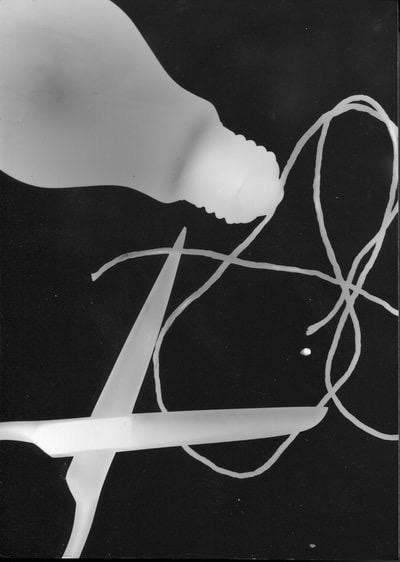
Edges in the dark room.
In lesson today we was given a task to get objects and take pictures of them.
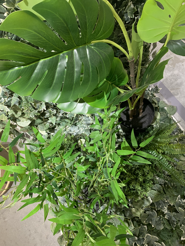
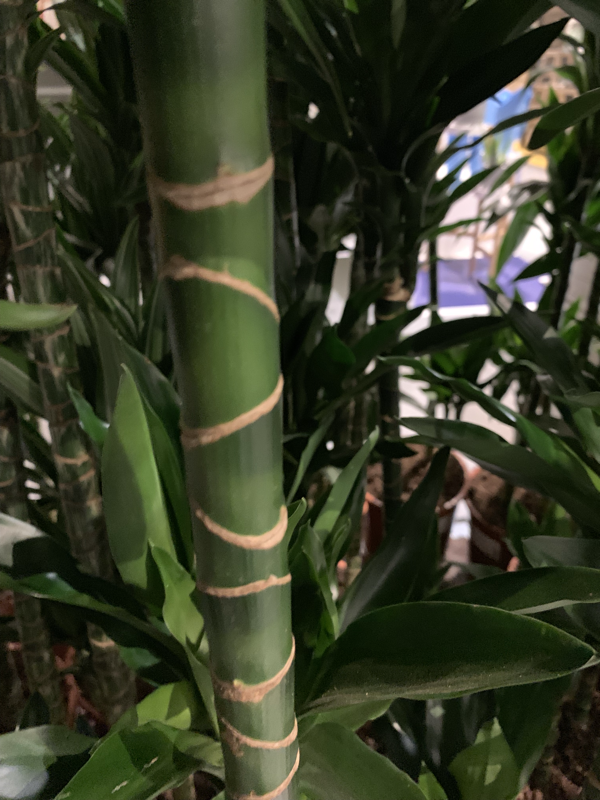
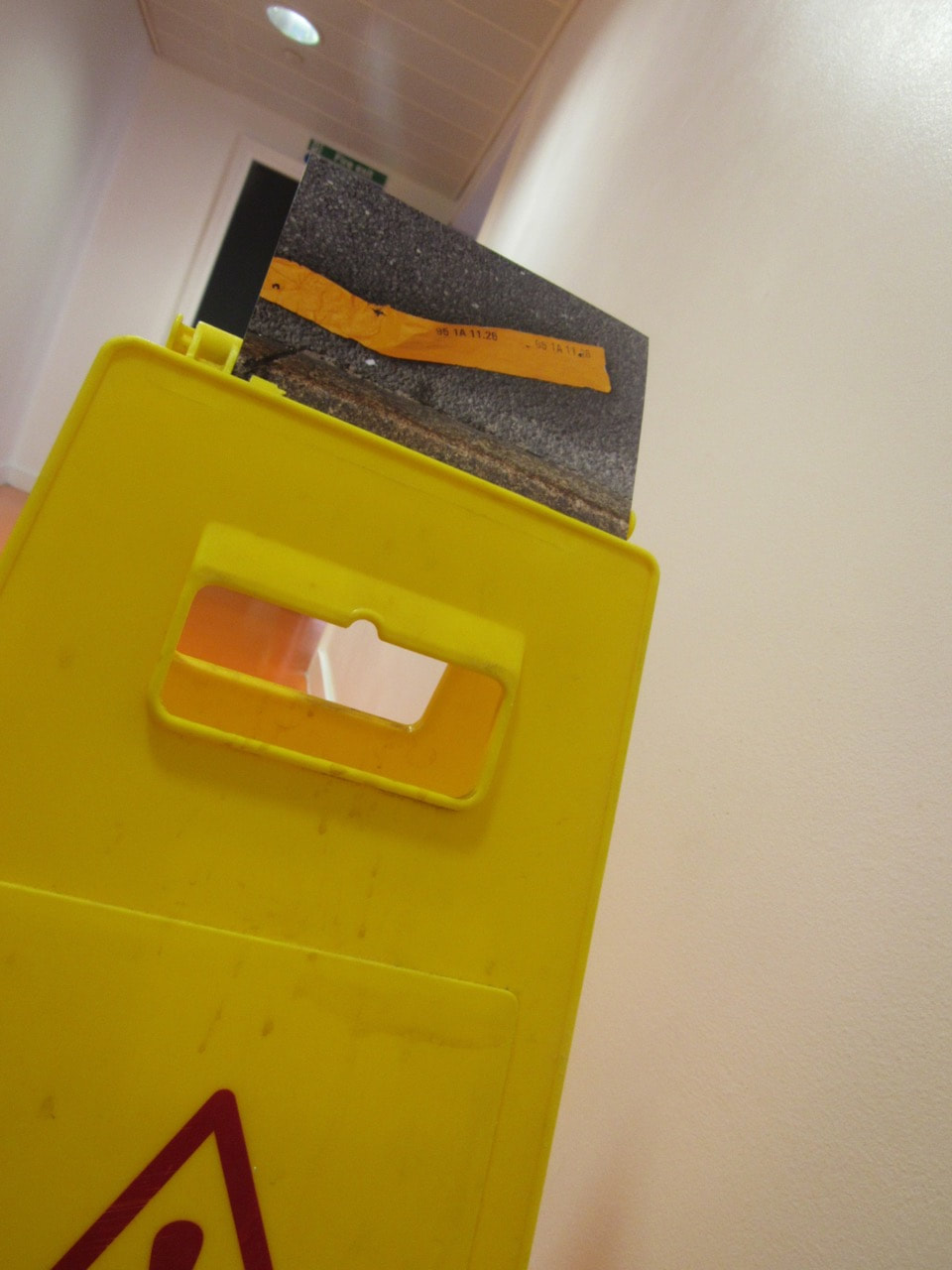
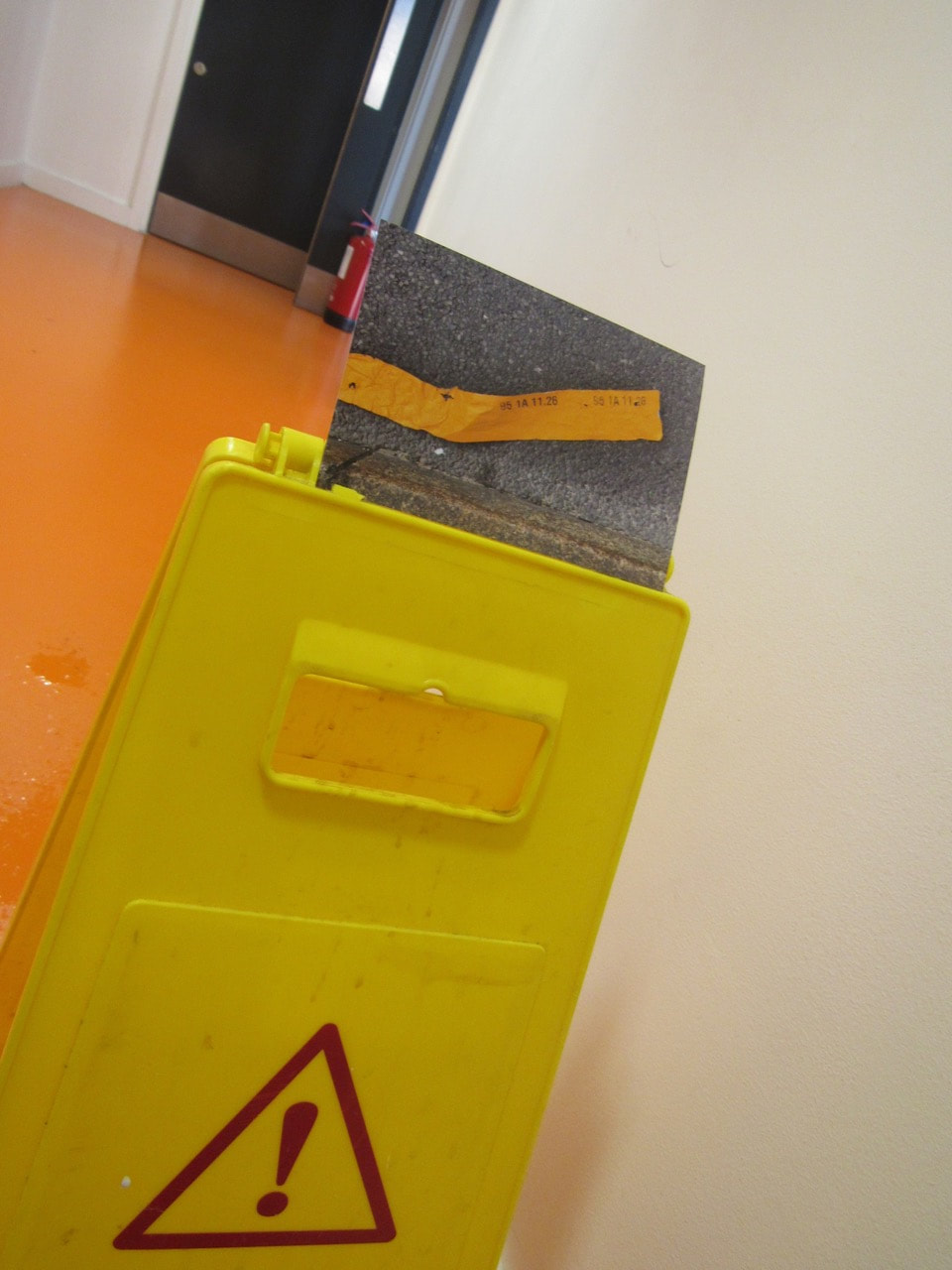
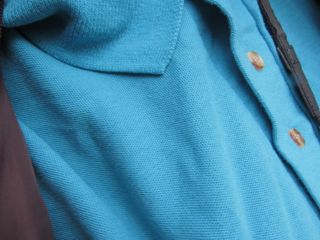
Edges in the classroom.
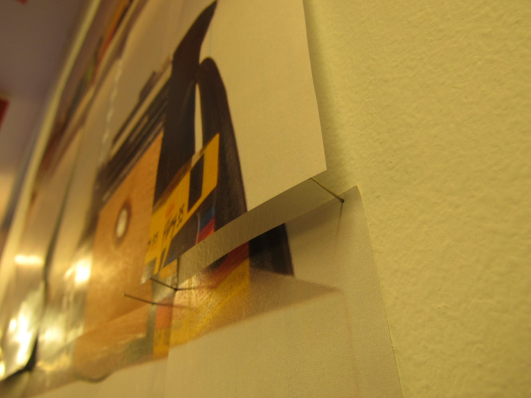

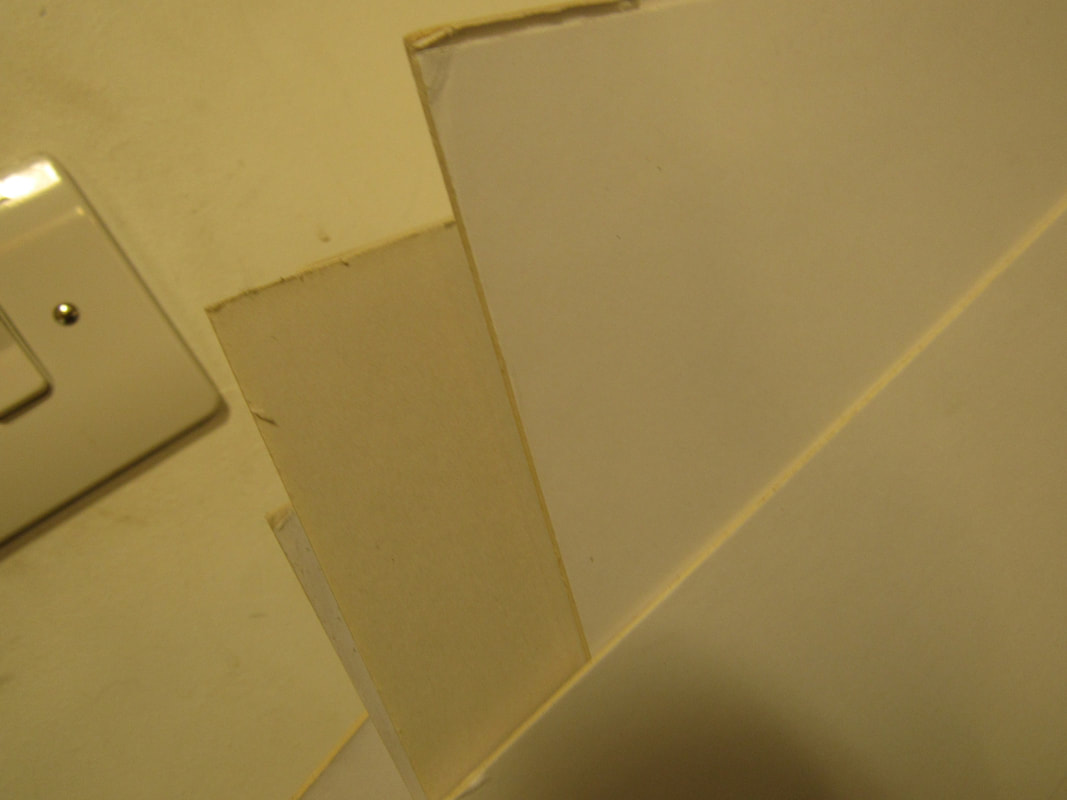
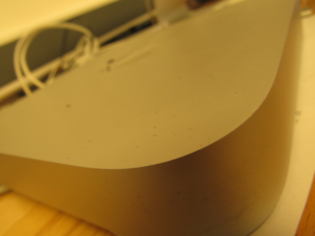
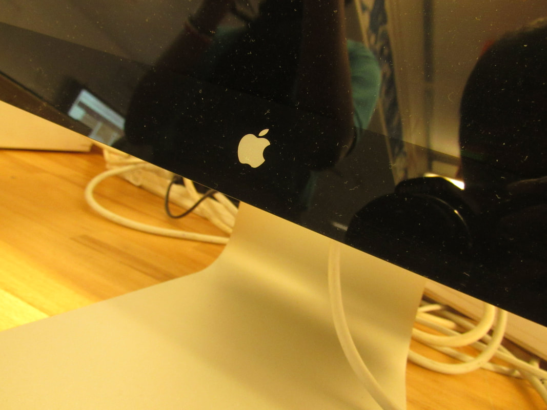


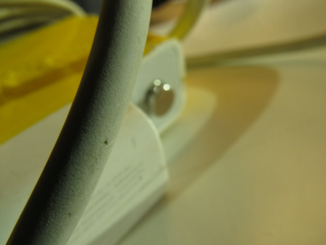
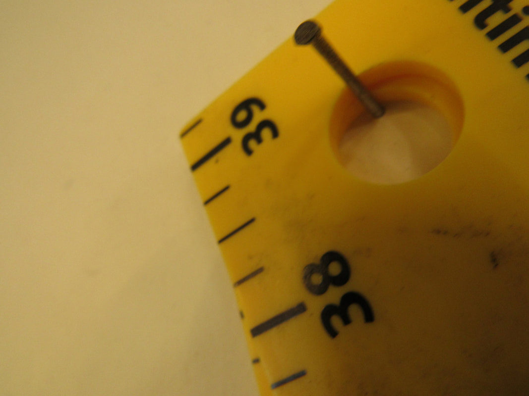
In class today we were given a task to take photos of edges around the classroom. This challenged my creative skills as I had to think out of the box about the edges I chose around the classroom. In addition I also used my imaginative skills as I had to think about what edges work and what don't .

|
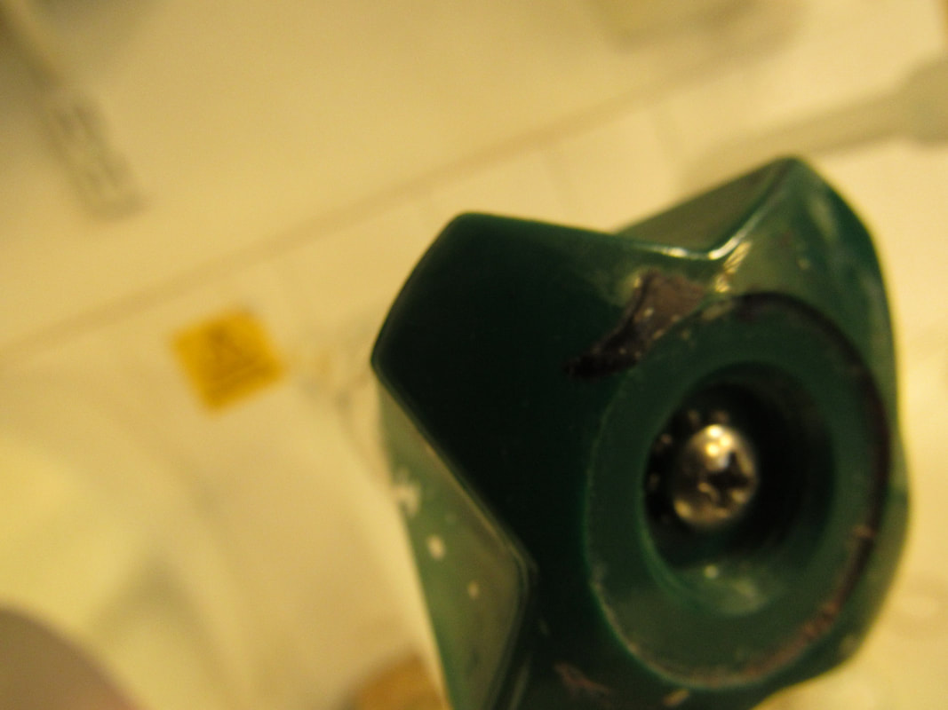
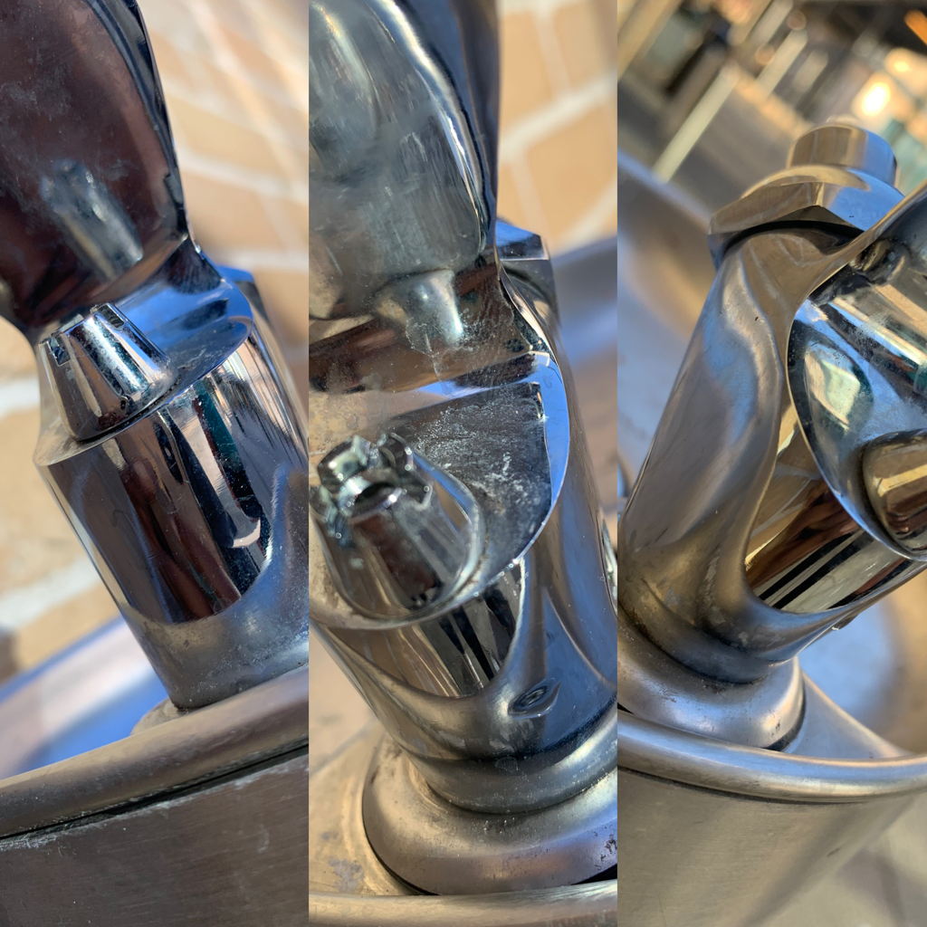
I am really pleased with this image for many reasons:
* The way the camera focuses on the tap *The way its not something someone would focus on *I like how the green stands out from the background * I like how its not a sharp edge like all the others |
Jan Groover
Jan Groover was an American photographer who spent the last part of her life in Montpon-Menesterol, France, with her husband, a painter and critic named Bruce Boice. Groover was born in Plainfield, New Jersey and died in 2012 at Montpon-Ménestérol.
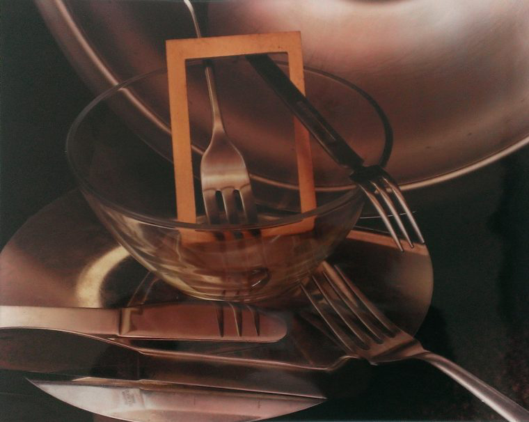
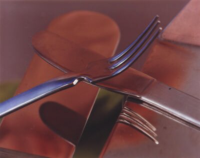
My favourite Jan Groover image
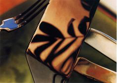
This is my favourite of Jan Groover's images as I like that it's cropped/ zoomed in so you can only really see the reflection on the knife. I like that the main subject of the image is reflected so it's showing what is behind the camera.
I also like that the colours and tone in the image are very calm and I feel that it's very peaceful. The fact that groover uses stainless steel to reflect a pattern is much more interesting and creative than if it was just a plant.
The background in the image is blurry and the cutlery is in focus in front, creating very sharp, clear edges in the image.
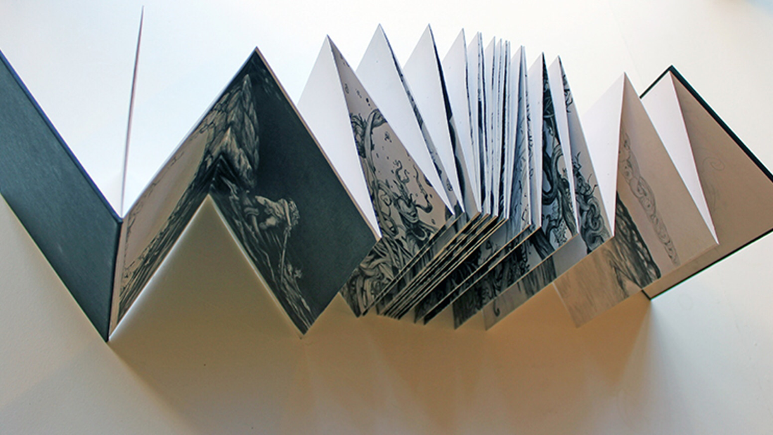
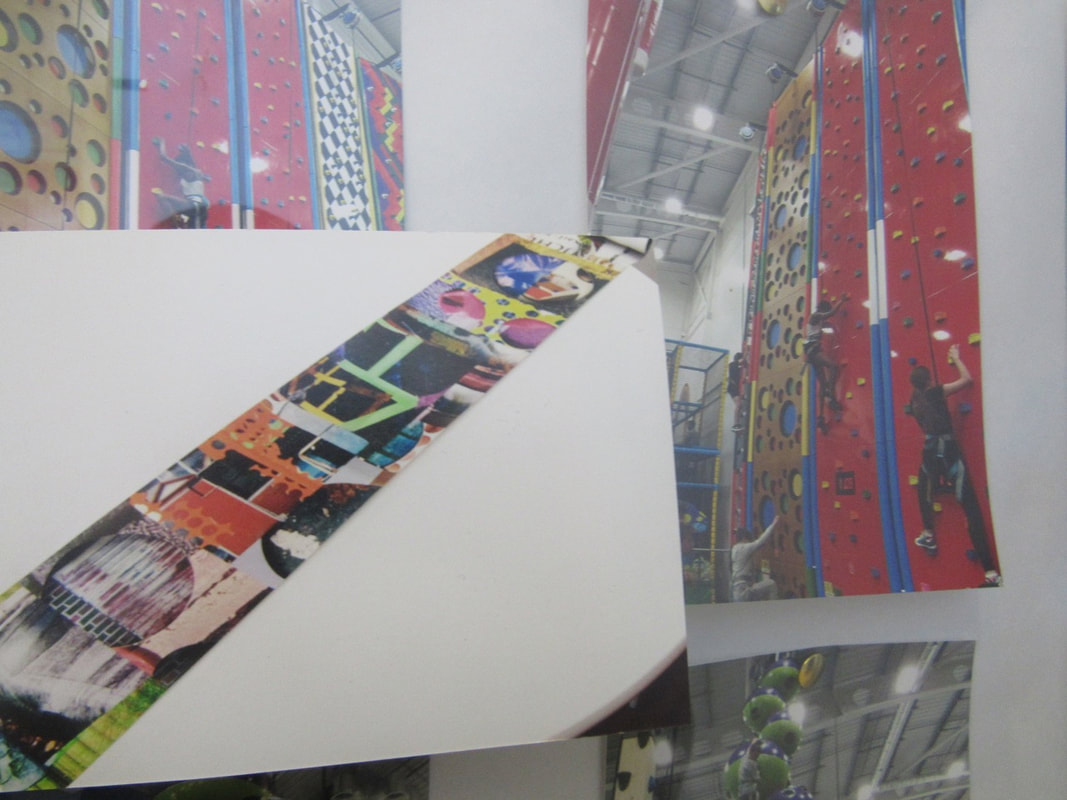
Triptych
|
What is a triptych?
A triptych is a work of art that is divided into three sections, or three carved panels that are hinged together and can be folded shut or displayed open. It is therefore a type of polyptych, the term for all multi-panel works. How do you create a triptych? You choose your three photos that compliment each other.Then open all three into photoshop after thats adjust all the photos to be the same size and expand the background so there will be space between the photos for a border once that is done you copy the other photons on there. Finally save and upload. |
Photos around school
Diptychs

A Diptych is two or three images which can be the same session or polar opposites to show opposition and contrasting of ideas.
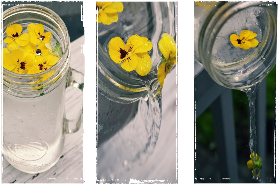
my most successful diptych
This is my favourite Diptych because...
- I like the message it have behind it .
- Another reason is I love the contrast of the two pictures because its different angles of the two pictures.
- They both link to each other.
- They have the same colours which contrast nicely.
- I think they are very original.
- I like the mixture of black and white.
Edges comparison prompt sheet
|
|
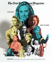
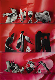
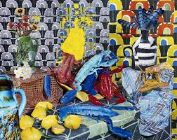
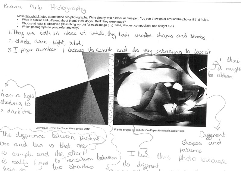
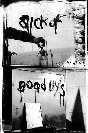
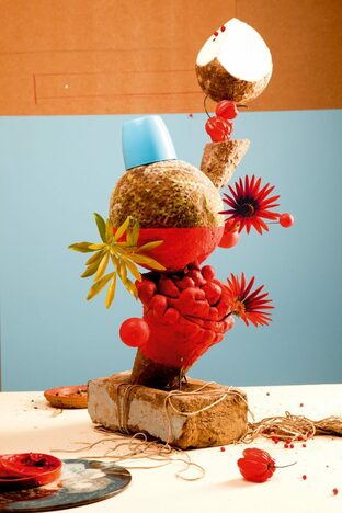
1.)Looking at these photo I can not see any similarities as one is black and white and the other one is a pop of bold colours.Picture two is very unusual as the placement on he photo looks very different to the pictures you see nowadays .picture one looks very dull out is a portrait photo and it spits into two sections one says " sick of" and the other half says "goodbyes". This interpreted thats someone has to say goodbye all the time and they are sick of it. picture two tells me this person is very creative and likes to take pictures you don't usually see.
2.)In photography one the quote on the picture "sick of goodbyes" struct me the most at me because its what everyone has to go through and the way the picture presents it is very affective as it is in black and the word look like they are melting and almost has fading affect. Which is gives the viewer an image of someone crying and the tears are rolling down their face. In picture two its very differs to the picture one. This picture look very right and kind of happy in some sense
. In addition it looks like they have pieced the main objects with many other objects with for to create some unusual statue . I believe there are no similarities as one seems very dull and sad and the other one looks happy and bright .
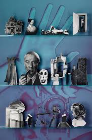
3.)The type of edges I cane see is these pictures are very different. In picture one I can see a mire which reflects and gives more depth to the photo. In picture two there are hardly any edges as all the objects are circular. In addition there are flowers which give the pictures some interesting points. If I could talk to the artists I would ask the photographer I would ask...
4.)If I was the artists I would name picture one is " goodbyes" as the pictures main focus is saying goodbye and expresses how they feel. For picture two if I was the artist is " A mothers kitchen". I would name the picture that because to me it looks like food with kitchen objects. To ado this it seems like there are many plants and normally I a mothers kitchen you would see flowers.If I was on picture one I would feel sad and depressed as that what the photo is giving off when I look at it. In picture I would feel happy and relaxed. I would feel this because thats the vibe the picture gives off nd what it looks like.
2.)In photography one the quote on the picture "sick of goodbyes" struct me the most at me because its what everyone has to go through and the way the picture presents it is very affective as it is in black and the word look like they are melting and almost has fading affect. Which is gives the viewer an image of someone crying and the tears are rolling down their face. In picture two its very differs to the picture one. This picture look very right and kind of happy in some sense
. In addition it looks like they have pieced the main objects with many other objects with for to create some unusual statue . I believe there are no similarities as one seems very dull and sad and the other one looks happy and bright .
3.)The type of edges I cane see is these pictures are very different. In picture one I can see a mire which reflects and gives more depth to the photo. In picture two there are hardly any edges as all the objects are circular. In addition there are flowers which give the pictures some interesting points. If I could talk to the artists I would ask the photographer I would ask...
- How do you feel when making the photos?
- what is little person you are holding ?
- what inspired you ?
- what objects did you use?
- what made you contrast the colour orange and blue ?
- what made you place those objects in that way ?
4.)If I was the artists I would name picture one is " goodbyes" as the pictures main focus is saying goodbye and expresses how they feel. For picture two if I was the artist is " A mothers kitchen". I would name the picture that because to me it looks like food with kitchen objects. To ado this it seems like there are many plants and normally I a mothers kitchen you would see flowers.If I was on picture one I would feel sad and depressed as that what the photo is giving off when I look at it. In picture I would feel happy and relaxed. I would feel this because thats the vibe the picture gives off nd what it looks like.
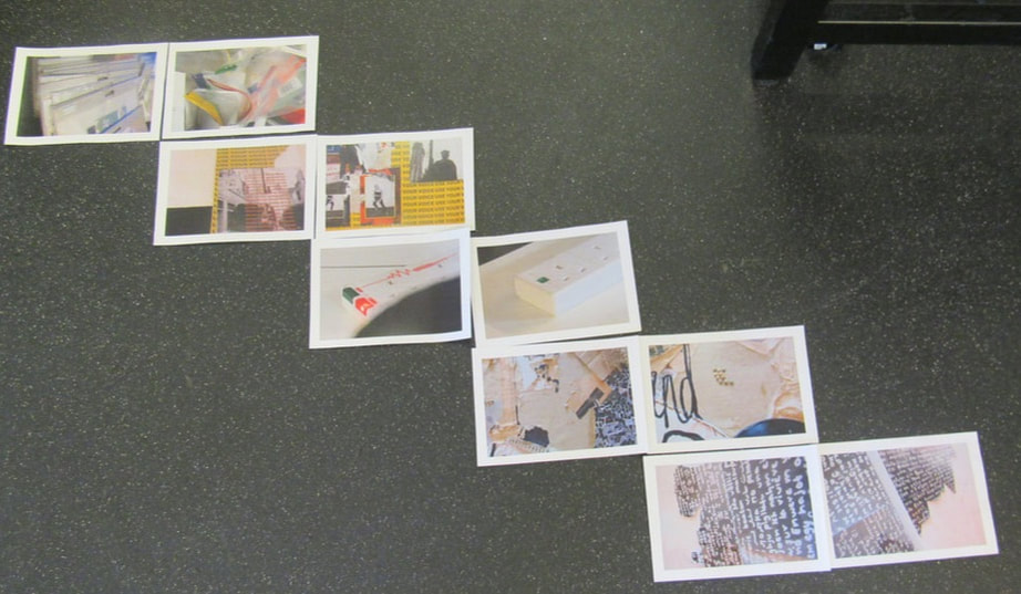
sequencing edges
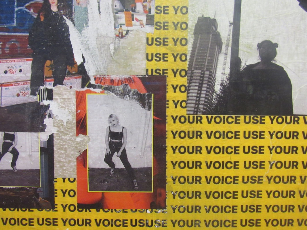
Bold Block colours
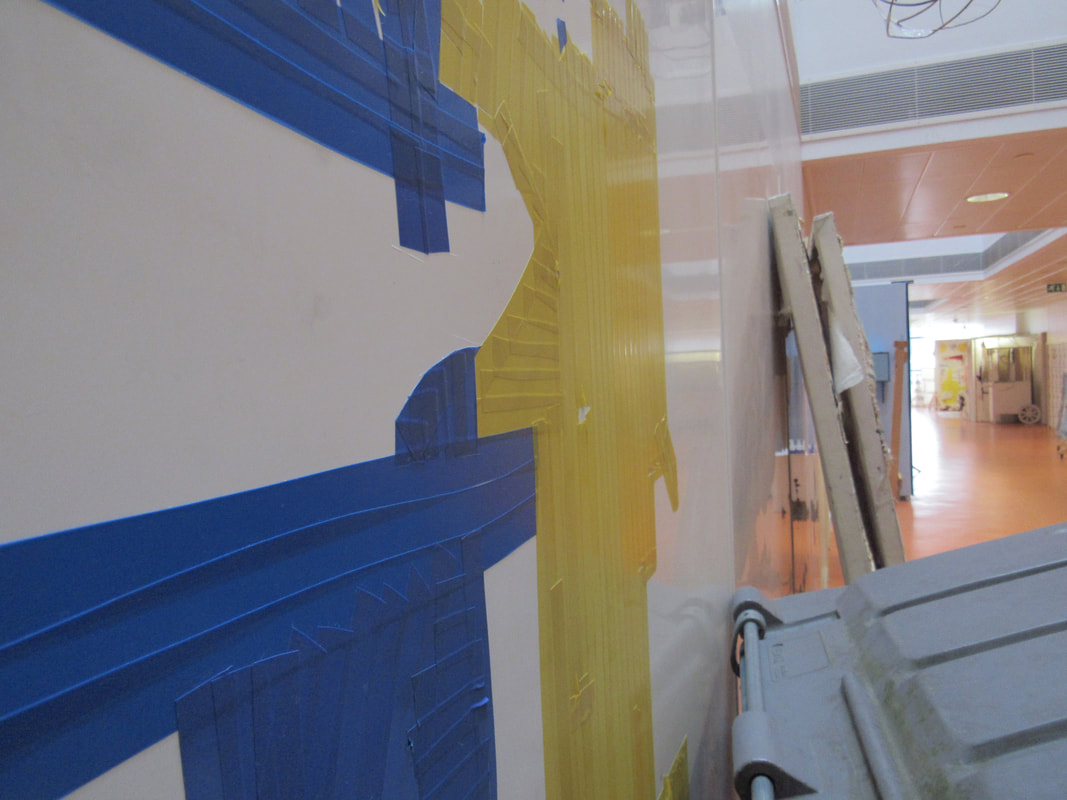
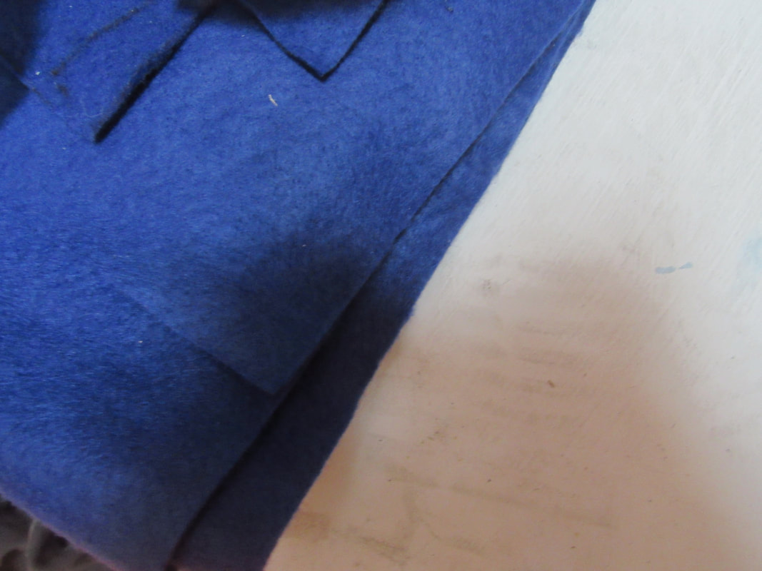
In this lesson I had to take photos of bold block colours. I have changed my personal projects to block colours because I like to catch peoples attention with photos and the way they are taken.
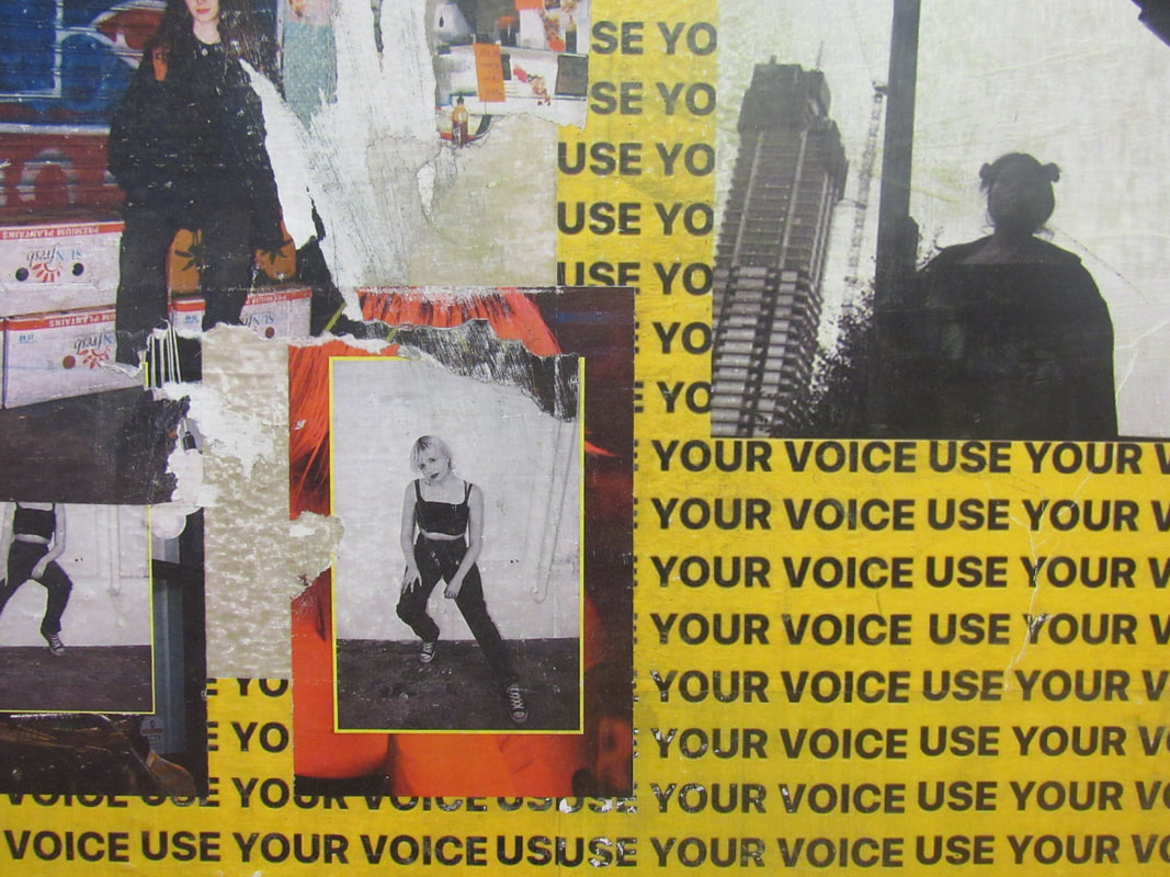
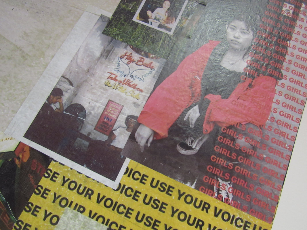
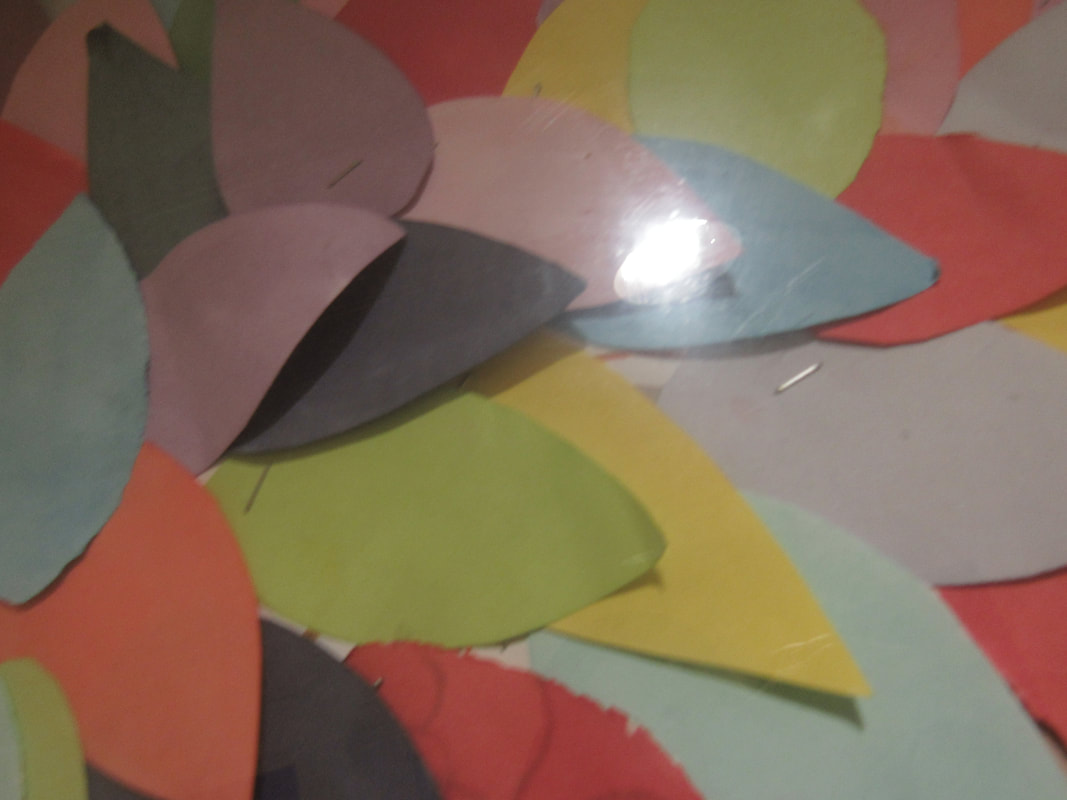
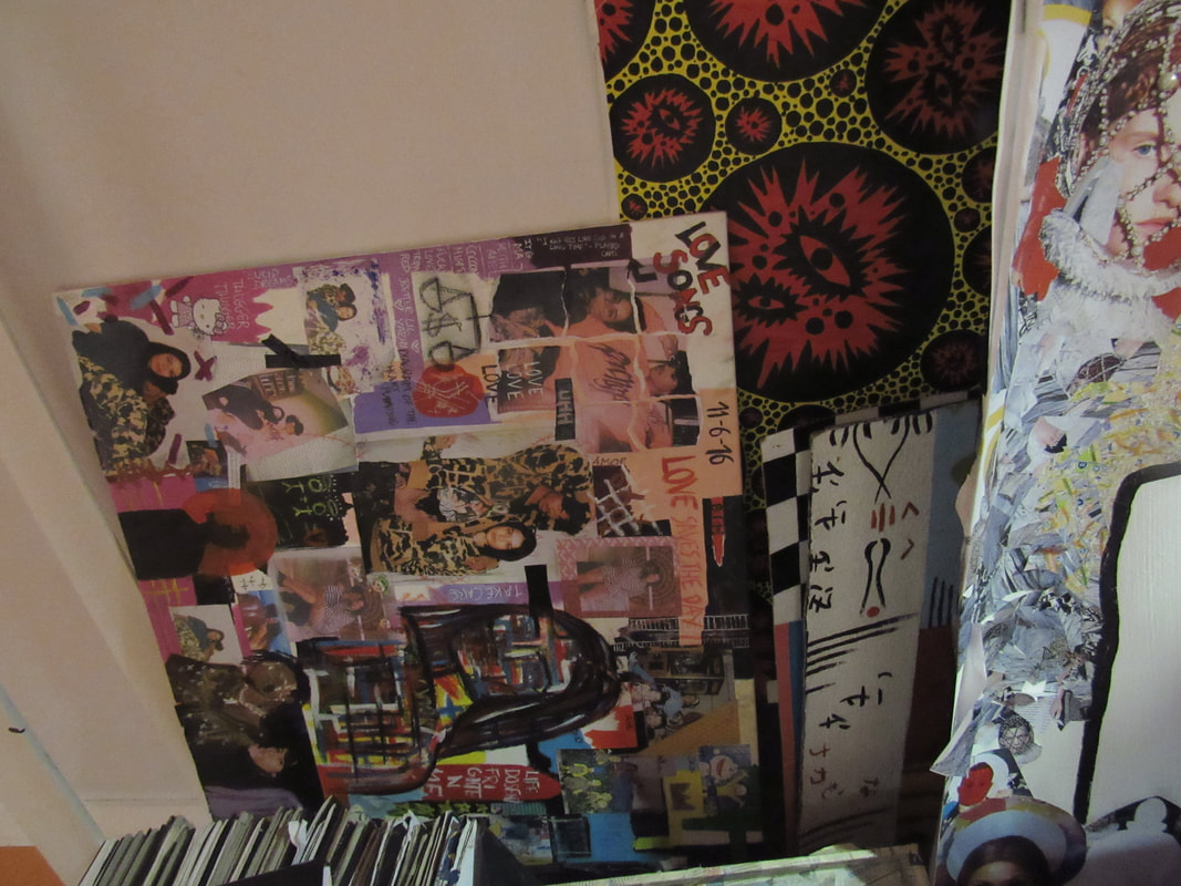
End of Edges project .
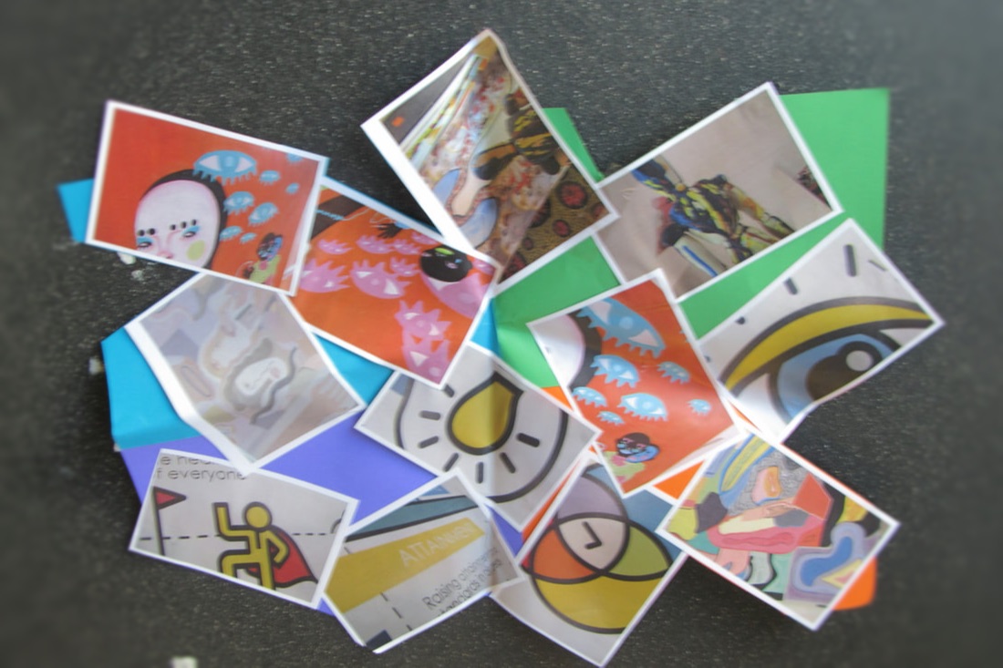


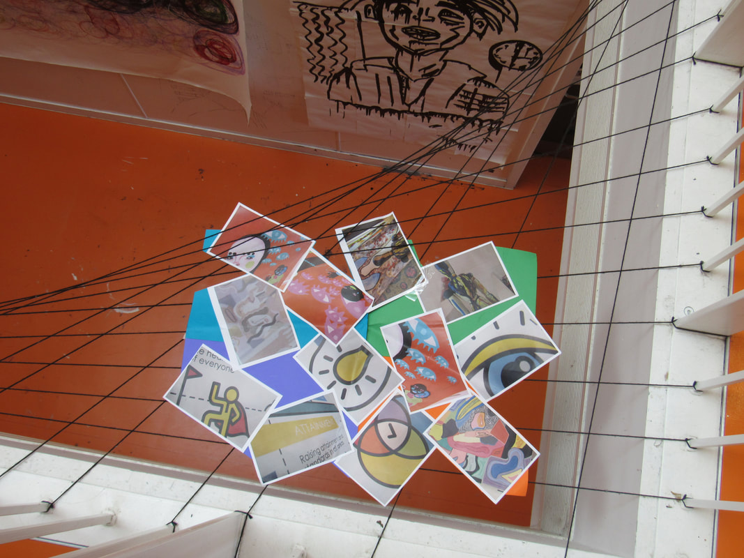

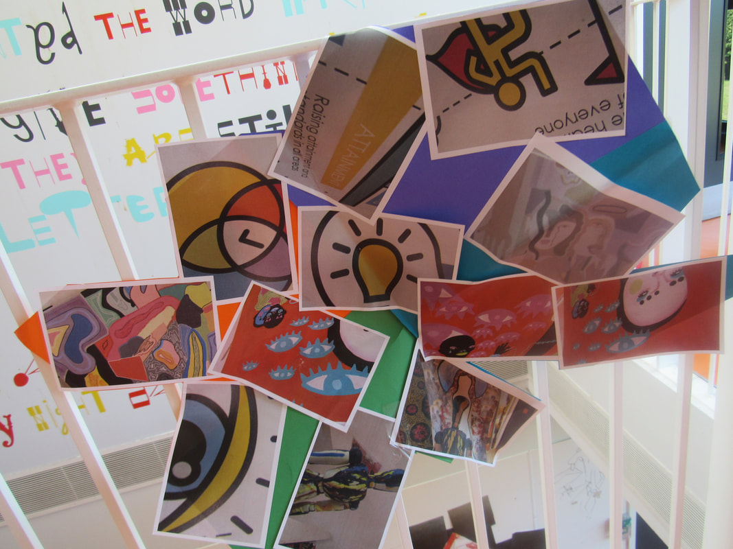
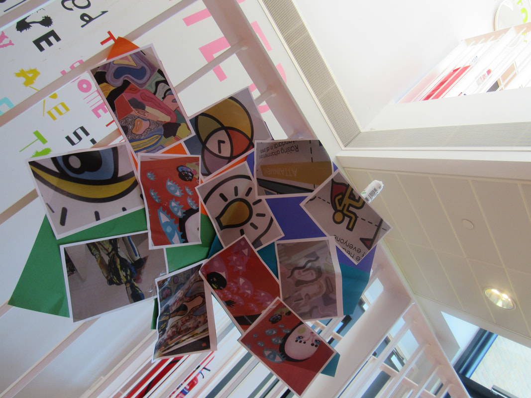
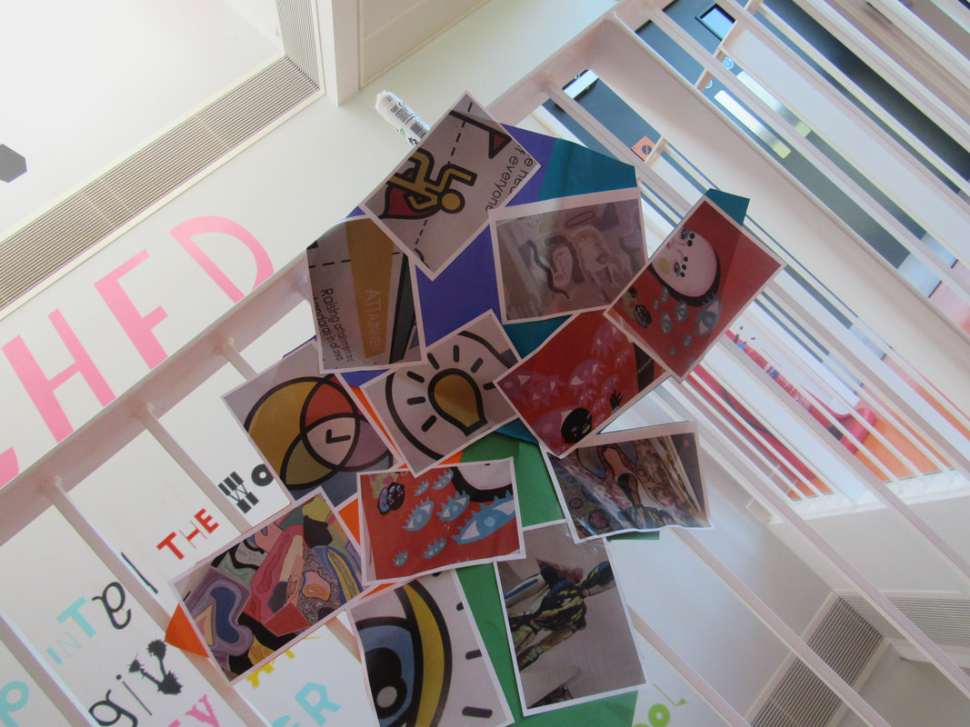
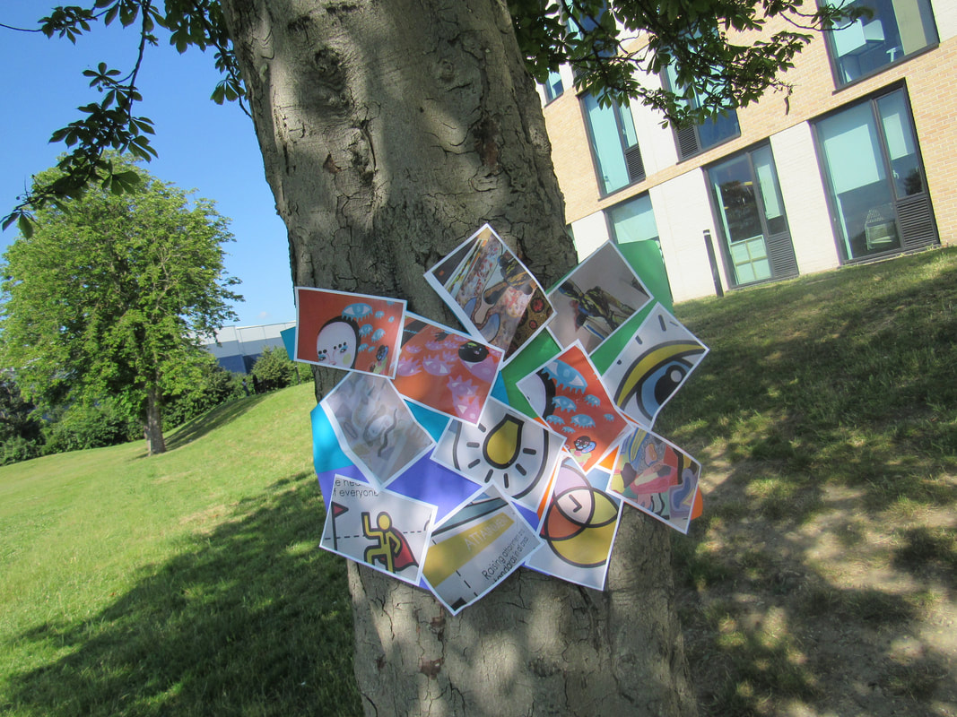
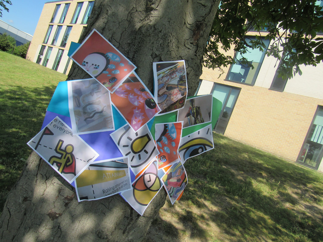
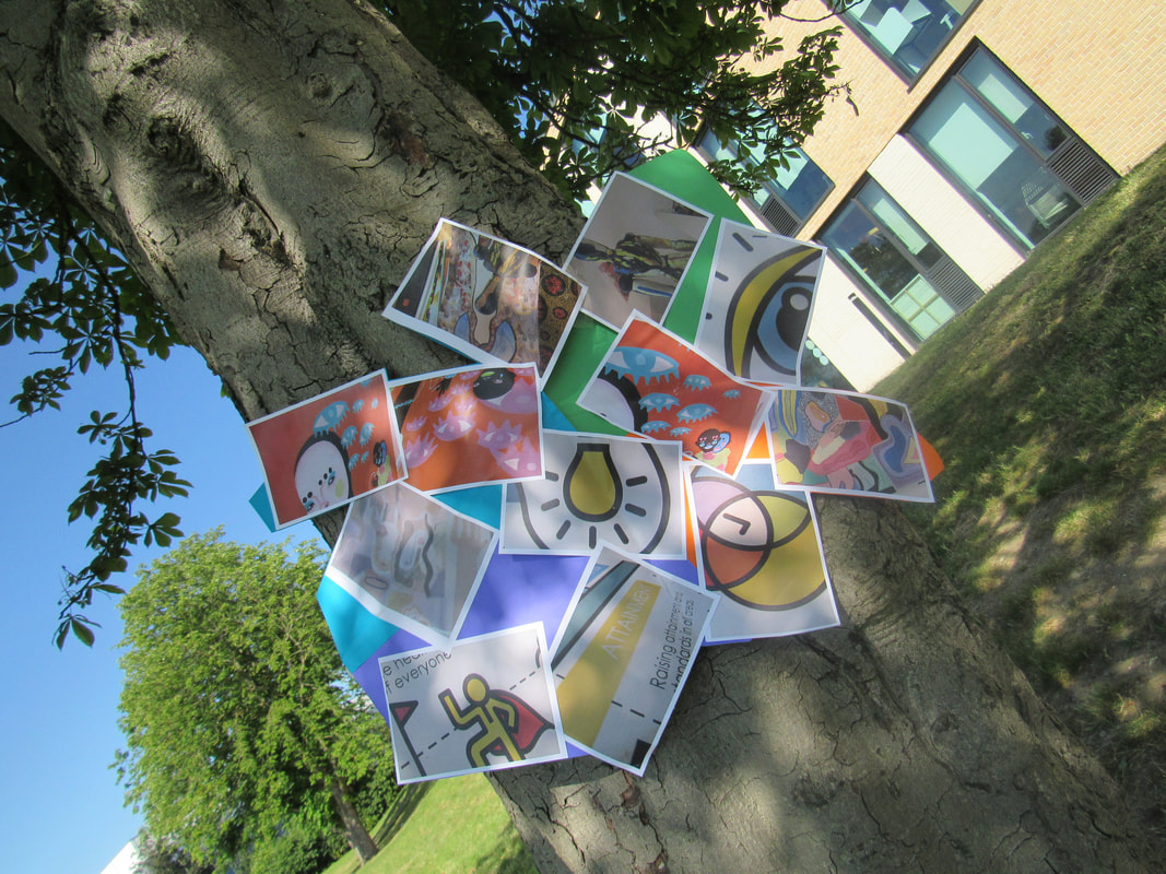

This the end of my edges project and I'm going to tell you what went wrong and what could be improved.
I decided to make an edges collage with all the photos mixed together over lapping and crossing each other as they have very bold and bright colours. Another example, of how I believe I done well is adding the similar photos with photos that are completely out the ordinary.To add to this, a third reason why I think I done well in this project is that I stuck to the rule of block colours and how they can contrast with each other.
The 3 things I believe I could improve on is that
maybe adding more pictures so it looks like they are more like a collage. Another reason is that I could add other shapes for example circles squares triangles to give the poster more depth and actually give the idea of a collage.Finally I think I could improve on adding more different and unique photos which would draw peoples attention a bit more.
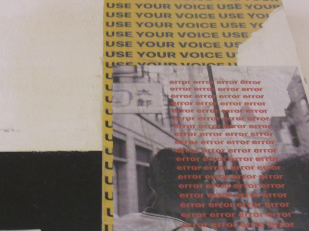
Cyanotype photography
Cyanotype is a photographic printing process that produces a cyan-blue print. Engineers used the process well into the 20th century as a simple and low-cost process to produce copies of drawings, referred to as blueprints.
How do you make one ?
- Choose a formula. This recipe makes approximately 50 8x10 inch prints. ...
- Mix the chemicals. The cyanotype is made up of two simple solutions. ...
- Prepare the canvas. Using a brush, simply paint the chemicals onto the material. ...
- Printing the cyanotype. ...
- Processing and drying.
